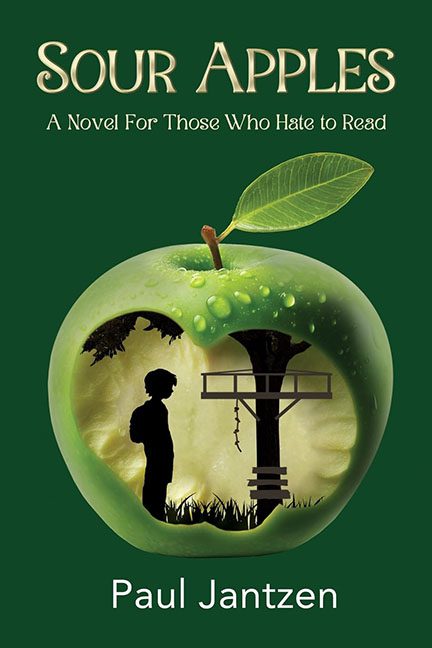
Somewhere deep in the valley of confused metaphors and haunted produce lies Sour Apples, a book cover that tries to be meaningful and ends up looking like a PSA against fruit consumption. Billed as “A Novel for Those Who Hate to Read”, this cover might actually achieve its goal — because one look at it and you’ll be sprinting away from literature altogether.
Let’s start with the apple. Oh, the apple. It’s not just green — it’s aggressively green. Glossy, stock-photo smooth, beaded with fake dew drops like it’s auditioning for a sparkling cider ad. But then, because someone read a design blog that said “symbols are powerful,” the apple has been digitally hollowed out to reveal… a silhouetted child gazing at a gallows and a broken swing set. Inside an apple. Because nothing says “engaging fiction” like death imagery embedded in your lunch.
The scene inside the apple is a black-and-white vector shadowscape, slapped onto the glossy interior like a crime against fruit and depth perception. The contrast is so severe it’s like someone said, “What if we mashed Clipart into a Granny Smith and called it profound?” The child is sad. The apple is sad. And you, dear viewer, are now sadder for having seen it.
But wait — there’s more. Hovering above this surreal fruit fiasco is the tagline:
“A Novel For Those Who Hate to Read.”
A bold, possibly self-sabotaging statement. It’s as if the book itself is warning you, “You don’t want this.” And after seeing the cover? We believe it.
The typography is a masterclass in neutral mediocrity. SOUR APPLES is rendered in a serif that wants to be literary, while the tagline floats in an awkward pseudo-fantasy typeface, seemingly styled by a high school yearbook committee. The author’s name — Paul Jantzen — sits at the bottom in a generic sans serif, looking like it’s trying to escape the page before the apple devours it too.
There’s no visual cohesion. No tonal clarity. Is it a middle-grade trauma novel? A philosophical allegory? A murder mystery set in an orchard? Your guess is as good as the designer’s — who apparently chucked the genre wheel into the compost bin and just started layering things in Photoshop until someone said “fine, good enough.”
In the end, Sour Apples is trying so hard to be deep and metaphorical that it tunnels straight through the core and out the other side into pure confusion. The only thing this cover succeeds at is being unforgettable — like a dream where your lunch gives you life advice and a mild existential crisis.
If this is a novel for people who hate to read, mission accomplished. They’ll run screaming before page one.
