
Every once in a while, a cover comes along that makes you question not only the art of graphic design, but also the English language itself. The Night Plummer & The Mockemortician is one such marvel — a title and design combo so baffling, it feels less like a book and more like the fever dream of a wizard who fell asleep in a Jo-Ann Fabrics clearance bin.
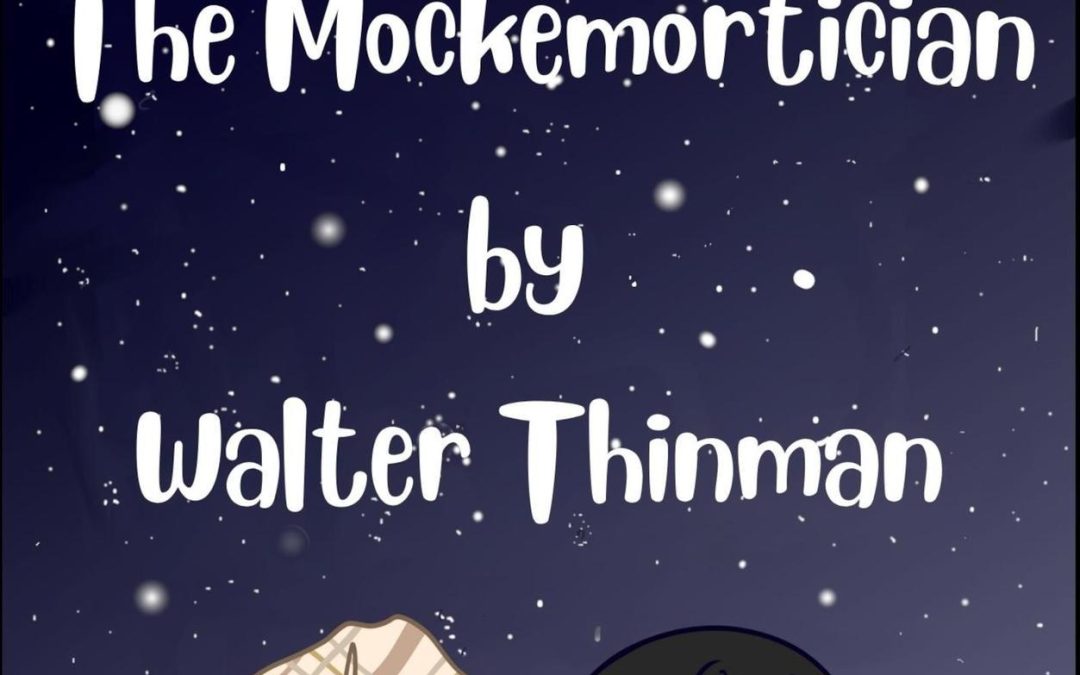
Let’s start with the font choice: a bubbly, cutesy typeface that looks ripped straight from a kindergarten craft project. Perfect for “Back to School Night,” disastrous for a book that clearly wants to be gothic and mysterious. It’s as if the cover is whispering “dark, brooding magic” in a voice that squeaks like a cartoon duck.
Then there’s the artwork. Behold, two mysterious figures: on the left, what appears to be a crumpled plaid laundry bag cosplaying as a main character, and on the right, a wizard hat decorated with paper snowflakes from a third-grade art class. This is not a clash of titans — it’s two discount Halloween costumes waiting to be put back in the attic. The background of generic star-speckled night sky only adds to the bargain-bin energy, like a holiday greeting card that lost its way.
And oh, the title itself. The Night Plummer & The Mockemortician. “Plummer” feels like a typo that made it past three rounds of editing, while “Mockemortician” sounds like a Pokémon evolution. Together they read less like fantasy characters and more like a rejected vaudeville duo.
Verdict: This cover is a triumph of confusion, a masterpiece of misfires. It doesn’t whisper mystery or menace — it shouts “please buy me, my designer was on autopilot.” In short: a Horrible Cover worthy of eternal mockery.