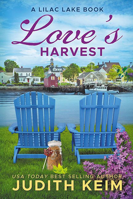
Some covers grab you with passion, others with drama, and then there are covers that sit you down in a pair of blue Adirondack chairs and hand you a mason jar full of seasonal confusion. Love’s Harvest wants to be cozy and charming, but instead it looks like a tourism brochure for a small town with a haunted chair problem.
Front and center are two bright blue lawn chairs that appear to have been violently copy-pasted onto the grass. They don’t cast a proper shadow, they don’t belong to the scene, and frankly, they look like they’re about to levitate. Forget romance — these chairs are possessed. And between them? The tiniest nod to “harvest” imaginable: a mason jar stuffed with a random leaf, a pinecone, and some straw. It looks less like the bountiful theme of the title and more like someone panicked and said, “Quick, put in something autumnal before deadline!”
The background doesn’t save it. We get a sleepy little harbor town straight out of a real estate postcard, with houses so generic you can almost hear the HOA rules being read aloud. Quaint, yes — but romantic? Only if your idea of “love’s harvest” is refinancing your waterfront mortgage.
And then we get to the typography. Love’s is all big, purple, and swoopy, like it’s auditioning for a Hallmark Channel logo. HARVEST, meanwhile, is in stiff block letters, stiff enough to belong on a food co-op newsletter. Together, they don’t blend so much as clash — the visual equivalent of wearing sneakers with a prom dress.
The tone? Utterly confused. Is this a sweet romance? Women’s fiction? An ad for Benjamin Moore’s “Lilac Lake” paint swatches? Hard to tell, because nothing in this cover commits to anything except mason jar panic and haunted furniture.
Verdict: Yes, this is a horrible cover. It’s not a harvest of love. It’s a harvest of mismatched fonts, floating chairs, and one very confused mason jar.
