
Some covers say danger. Some covers say power. And then some covers scream “I discovered neon glow effects in Photoshop and absolutely refused to stop.” Welcome to Bratva Warriors, a design that feels less like gritty mob drama and more like a Soviet karaoke night hosted in the back of a strip club.
Let’s start with the fonts, because oh boy. BRATVA is pink and fuzzy, WARRIORS is red and radioactive, and together they look like a bar fight between Microsoft WordArt presets. The crowning jewel? The “#1” in the corner, slapped on like a clearance sticker from the Dollar General DVD bin. It’s glowing too, of course — because if one thing screams organized crime, it’s neon signage.
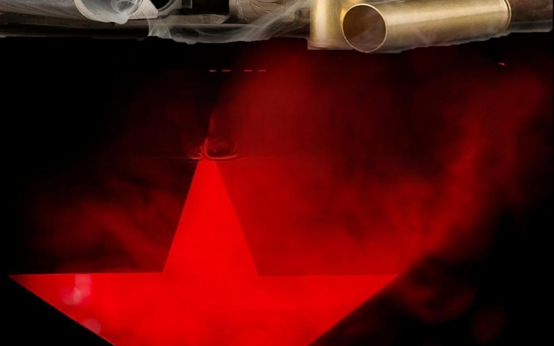
And then we get to the imagery. Floating in the middle is a shotgun with two shell casings tossed in the air like party confetti. The smoking barrel effect might have been edgy in 2003, but here it looks more like someone dropped a clipart cigar into the muzzle. Add in the fact that it’s completely disconnected from the rest of the composition, and it feels less like Bratva Warriors and more like Basic Photoshop Warriors.
Now, let’s talk about the red star at the bottom — glowing, hazy, and utterly ridiculous. Instead of symbolizing strength, rebellion, or Russian underworld menace, it looks like the logo for a budget karaoke bar where the mic hasn’t worked since 1997. Beneath it, the author’s name sits awkwardly in a black box like an afterthought, further proving that this entire cover is just “random elements, stacked vertically.”
The whole thing is a masterclass in bad layering. Nothing integrates, nothing belongs, and nothing screams “thrilling Bratva underworld” — unless, of course, you think mobsters settle their wars with glow sticks.
Verdict: Yes, this is a horrible cover. It’s not mob drama, it’s not gritty action — it’s Call of Duty: Clipart Ops.