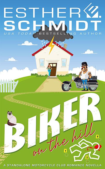
Strap in, because Biker on the Hill just skidded off the road straight into Microsoft ClipArt territory, and the wreckage is spectacular. This cover claims to be “a standalone motorcycle club romance novella,” but the only thing it stands alone in is looking like a bad PowerPoint slide from a high school health class.
Front and center, we’ve got our “biker” — a cartoonish hulk with sunglasses and a beard that screams “discount South Park extra.” He’s leaning on his motorcycle in a way that makes you wonder if he actually knows how to ride it, or if he just parked it there for the stock photo session. Meanwhile, a woman lurks in the doorway of the house behind him, hand on hip like she’s waiting for someone to deliver the pizza. Romantic tension? Try awkward clipart family reunion.
Then comes the pièce de résistance: the chalk outline. Yes, because nothing says romance novella like the outline of a dead body complete with little numbered evidence tags. CSI called, they’d like their graphics back — preferably not in Comic Sans proportions. Toss in some inexplicable lawn tire tracks, a lightning bolt zapping the roof, and a random cat loafing in the grass, and you’ve got yourself a cover that looks like it was designed by a confused middle schooler toggling between The Sims and a murder mystery worksheet.
The title typography doesn’t help. BIKER is slapped across in giant block letters big enough to be read from space, while on the hill is scrawled underneath like an afterthought written on a sticky note. It’s trying for playful contrast, but lands squarely in genre confusion — is this supposed to be a biker romance, a cozy parody, or a Cartoon Network pilot that never aired?
Verdict: Yes, this is a horrible cover. It’s not romance, it’s not mystery — it’s just chaos on two wheels. Someone please take the design software away before another chalk outline shows up.
