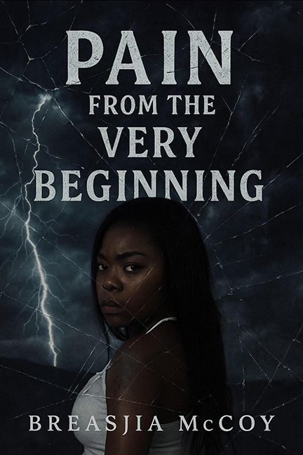
This cover is so on the nose, it might as well come with a thunderclap and an ominous “dun-dun-dunnn” sound effect. Pain from the Very Beginning wants to deliver raw emotional depth — instead, it delivers Photoshop filters, murky shadows, and a lightning bolt that looks like it was borrowed from a Weather Channel green screen.
Let’s start with the model. Or rather, let’s try to find her. She’s half-swallowed by darkness, peering at us like she wasn’t told there’d be a photoshoot and is now deeply regretting the whole situation. Whatever powerful presence she was meant to have is smothered under clumsy lighting and a cracked-glass texture that screams “free Canva filter of the week.” Apparently, pain = windshield damage.
And then there’s the typography. The title stretches across the cover in what can only be described as “Microsoft Word Bold, 1995 edition.” Giant stacked all-caps serif, no kerning love, and the kind of rigid spacing that screams: “middle school assembly presentation.” It doesn’t say literary intensity; it says: “Don’t do drugs — from the very beginning!”
The stormy background, with its single copy-paste lightning bolt, looks less like atmosphere and more like a severe thunderstorm watch for central Ohio. Paired with the fractured-glass overlay, the effect is less tragic power and more… “Oops, my windshield cracked again, better call the insurance company.”
Verdict: Yes, this is a horrible cover. The pain isn’t from the story, it’s from looking at the design. A lightning rod might clear up the static, but until then, this cover is just storm clouds and shattered clichés.a
