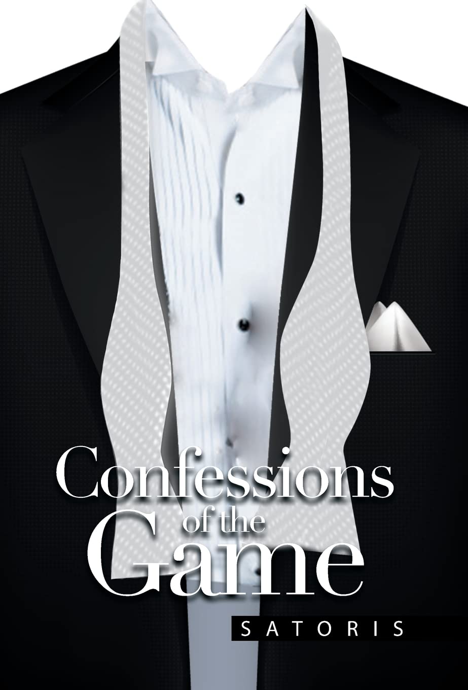
Here we go, folks. A book cover that doesn’t just whisper “budget,” it full-on confesses it. Right out loud.
Let’s start with the most glaring issue: the missing head. Nothing says mystery like a tuxedo that’s been abandoned by the human who was supposed to be inside it. We’re left staring at a chest with no personality, no intrigue, and no bowtie. Was the guy too embarrassed to show up? Or was this suit cursed and now walks among us on its own, hunting for better typography?
Speaking of typography — the title design. It’s as if the designer got tired halfway through and just shoved “Confessions of the Game” smack onto the torso, hoping the words would carry themselves. Spoiler alert: they don’t. The kerning and layout give us “Confessions of the Ga…me,” like the cover itself is stuttering while trying to look classy.
And then we have the pièce de résistance: the tie. Or is it? Because this white strip of fabric hanging down looks less like silk and more like two seatbelts in an Uber. It doesn’t scream elegance, it screams “buckle up, this is going to be rough.” The weird pixelated texture only adds to the effect, making it look like someone screen-capped a stock photo at 72 dpi and prayed no one would notice.
The background doesn’t help. The black suit blends into black nothingness, which means all your eye gets is a floating bib surrounded by dead space. It’s giving PowerPoint cover slide, not sexy thriller.
In short, this is a confession that should’ve stayed private.

