
In the Devil’s Arms – Or in the Discount Wig Section?
Every so often, a romance cover comes along that makes you squint, tilt your head, and ask: “Is this passion… or is this just two exhausted models forced into an uncomfortable pose for $25 and a ham sandwich?” Welcome to In the Devil’s Arms by Gianna Simone, where the devil’s greatest trick wasn’t temptation — it was convincing us this Photoshop job passed as romance marketing.
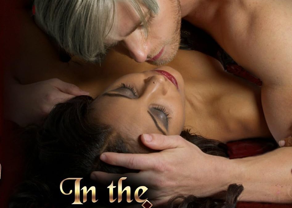
Let’s start with the models. The man looks like Legolas had a bad night out and woke up with a Party City wig that was brushed once, in 2007. His expression isn’t passion; it’s mild confusion, like he just remembered he left his headlights on. The woman, meanwhile, is doing her best “resting romance heroine face,” but instead comes off like she’s trying very hard not to sneeze while someone points a fan at her eyelashes.
Now onto the font choices. The word Devil’s is aggressively stylized, like the designer thought, “What if every serif was also a demonic tail?” It’s less sultry evil, more clip-art PowerPoint from your middle school friend who “was really into fonts.” The rest of the text? Just chilling there, hoping no one notices the design carnage happening up top.
And let’s not ignore the background — ah yes, mystical red gradients and occult doodles slapped around like someone downloaded “mystical symbols” off Shutterstock and thought, nailed it. It doesn’t enhance the atmosphere; it looks like the devil himself gave up halfway through decorating.
So here we are: a cover that should say “dangerous, forbidden passion” but instead whispers “awkward Renaissance Faire engagement shoot.” Truly, the devil works hard, but this cover designer worked harder… to make something this unsexy.