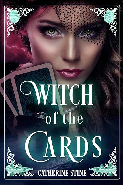
Some covers pull you into a mystical world full of intrigue and shadowy fortune-telling. Witch of the Cards, however, pulls you straight into the clearance aisle of a craft store where Photoshop filters go to die.
Let’s start with our witch. She’s been smoothed, airbrushed, and lit in such a way that she’s less a living, breathing human and more a heavily retouched perfume ad. Her skin looks like it was dipped in matte paint, and the veil perched across her forehead screams, “help, I got tangled in a mosquito net, but let’s pretend it’s fashion.” Her eyes burn with the intensity of someone who’s just been told this is the 400th version of the cover draft — and it still isn’t working.
The cards she’s holding? Oh, honey. These look like they were downloaded from a free clip-art site and slapped into her hand at the last minute. The angles don’t match, the lighting doesn’t match, and frankly, the cards look like they’re made of the same material as cereal box cutouts. If this witch told your fortune with these, you’d probably ask for a refund.
And then, oh yes, the pièce de résistance: the flourishes. Whoever designed this cover decided to crown the witch’s head with seashells at the top, as though she moonlights as the Little Mermaid’s goth cousin. Down below, we get decorative fish — because nothing says occult power like some half-baked clip-art sturgeon wriggling in the corners. Why fish? Why shells? Why not just add a treasure chest and call it Witch of the Aquarium?
The frame itself feels like it came free with early-2000s Microsoft Publisher, the kind of thing you’d use to spice up a “lost cat” flyer. It’s the design equivalent of putting rhinestones on a trash can — sparkly, sure, but still holding garbage.
In short, this cover isn’t mystical, it isn’t spooky, and it isn’t even stylish. It’s more like someone hit “shuffle” on the asset library and decided, “yep, shells, fish, witch — we’re good.”
Verdict: Less “witch of the cards” and more “witch of the clip art bargain bin.”
