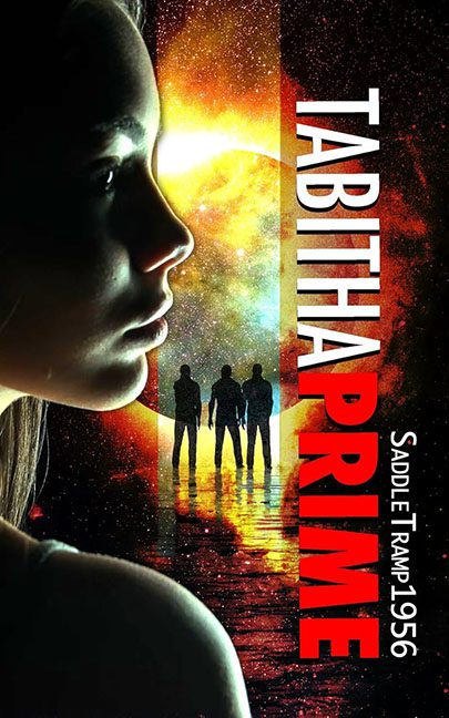
Space is vast, mysterious, and awe-inspiring. Tabitha Prime, on the other hand, is cramped, awkward, and confusing — a visual reminder that not every trip to the stars deserves a launch.
Let’s start with the giant floating head. Our heroine’s face looms so large it feels like she’s about to photobomb the entire galaxy. Lit with the subtlety of a flashlight under a blanket, she doesn’t look powerful or transcendent — she looks like she’s staring at the cover’s design flaws, silently judging every choice.
Behind her? The galaxy wallpaper special. Oversaturated stars and swirls give us less “cosmic mystery” and more “screensaver from 2007.” It’s generic space filler, with no depth or connection to the actual characters.
Speaking of characters — at the bottom, we meet the Silhouette Squad. Three dudes standing stiffly like they’re posing for a Men In Black fan convention flyer. Their presence raises more questions than it answers: Who are they? Why are they identical? Why don’t they cast shadows? They look less like interstellar badasses and more like default placeholders from a stock photo site.
Then comes the typography. TABITHA PRIME is slammed down the side vertically, split into white and red letters that fight with each other like rival fonts on a bad PowerPoint slide. Instead of bold and futuristic, it just looks like WordArt on tilt. And the author’s name? Saddle Tramp 1956 is squished into the corner, more CB radio handle than sci-fi visionary. If you’re going to put your name on a book, at least let it breathe.
The color palette doesn’t help. Between the orange blast, the neon greens on the face, and the harsh red title, it’s pure chromatic chaos. Nothing blends, nothing balances — it’s like three different covers got smashed together and called it done.
The verdict? Tabitha Prime wanted to be an intergalactic epic, but the cover screams sci-fi parody poster from the discount bin. With its floating flashlight face, random silhouettes, and title treatment straight out of vertical WordArt hell, this book has boldly gone… where no design should go.
