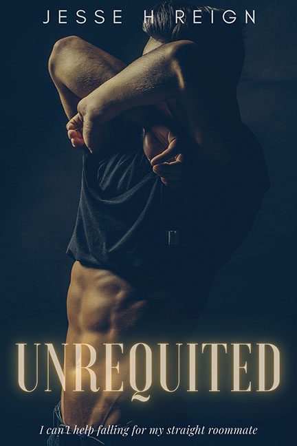
Romance novels are supposed to be about passion, vulnerability, and emotional pull. Unrequited instead gives us… a torso in the dark, contorted like it’s auditioning for a deodorant commercial.
Let’s start with the pose. Our mystery man isn’t brooding, he’s arm-locked in an escape attempt from his own T-shirt. The way his arms cover his face makes him look less like an object of desire and more like he’s either mid-yoga pose, stretching after a nap, or deeply regretting skipping laundry day. His abs might be sharp enough to slice deli meat, but the body language is pure “please hold while I struggle out of this sweater.”
The lighting doesn’t help. Drenched in muddy shadows and sepia tones, the whole vibe feels more CSI promo shot than aching love story. If this is supposed to sell romance, it’s got all the intimacy of a crime scene re-enactment.
And then we hit the typography.
- UNREQUITED glows across the bottom in giant letters like a Vegas casino marquee. Romance? No. Cheap signage? Yes.
- The author’s name at the top is so faint it looks like it’s trying to sneak off the cover before anyone notices.
- And the subtitle — “I can’t help falling for my straight roommate” — is tossed at the bottom in tiny italics, like an embarrassed afterthought muttered under the designer’s breath.
The biggest crime here, though, is the mismatch. This book wants to be about longing, heartbreak, and yearning love. The cover instead screams “dark fragrance ad featuring an ab model who doesn’t know where to put his arms.”
The verdict? Unrequited didn’t give us a cover of passion and desire. It gave us a belly in the shadows with a side of Vegas WordArt. If romance is supposed to be about emotional connection, this cover ghosted the feelings and just went straight for Axe Body Spray energy.
