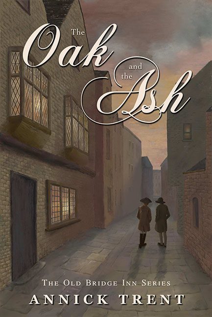
Historical fiction should sweep you away to another time and place. The Oak and the Ash instead takes you on a dreary stroll through Beige Alley, circa Whenever.
Let’s start with the artwork. We’ve got cobblestone streets, brick buildings, and two anonymous figures wandering aimlessly. Sounds atmospheric, right? Wrong. The entire thing looks like it was painted by someone who once glanced at a history book and thought, “Yeah, I got this.” The perspective is stiff, the textures are flat, and the lighting is nonexistent. It’s less “immersive historical world” and more backdrop for a middle school diorama project.
The color palette doesn’t help. Everything is brown, mauve, or taupe — a visual feast of wet cardboard chic. This isn’t dusky and moody; it’s dreary and lifeless. It’s as if the artist decided to drain the painting of atmosphere just to match the excitement level of the cover design.
And then we hit the typography. The words “Oak” and “Ash” are smothered in ornate script so swoopy and overbearing they look better suited for a vintage shampoo bottle. Pair that with the plain serif text of The Old Bridge Inn Series and the author’s name, and you get fonts that aren’t harmonizing — they’re arguing. Loudly. In public.
As for the two shadowy figures? They’re supposed to add intrigue, but instead they look like cardboard cutouts taking a polite evening stroll. Faceless, detail-free, and utterly generic, they aren’t characters. They’re placeholders.
The verdict? The Oak and the Ash should have felt rich and atmospheric. Instead, it’s a dull, faceless, beige walk into nothingness with a title font that screams “luxury conditioner.” Forget oak, forget ash — the real story here is boredom.
