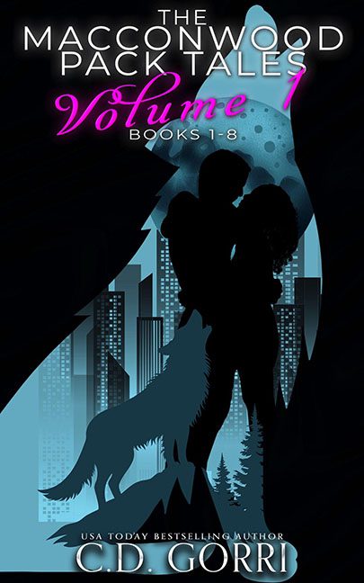
Paranormal romance covers are supposed to drip with atmosphere — think moody shadows, glowing eyes, and just enough mystery to lure readers in. The Macconwood Pack Tales, Volume 1 instead looks like it was pieced together from a bargain bin of clip art silhouettes and neon text effects.
First, the couple. Our supposed lovebirds are nothing more than two stiff black cardboard cutouts locked in an embrace. There’s no heat, no chemistry, just the romantic energy of bathroom signage trying to smooch. If this is supposed to be passion, it feels more like awkward mannequin rehearsal night.
And then there’s the wolf. Oh, the wolf. Instead of lurking in the shadows or prowling under moonlight, we get a bright cyan cutout slapped onto the bottom corner like a glowing mascot for a high school sports team. It’s not primal or threatening — it’s basically shouting “Go Werewolves!” in Comic Sans.
The background is no better. We’ve got a city skyline smashed into a giant blue moon with no attempt at blending. Is it a paranormal thriller? A dystopian wolf romance? Or a PowerPoint slide on urban wildlife management? The answer is “yes.”
And then the fonts — the true howling tragedy.
- “Volume 1” is written in hot pink, swoopy script straight off a nail salon coupon.
- The series title just floats at the top, stiff and plain, like it’s deeply ashamed to be here.
- The author’s name? Embossed with a metallic glow effect that screams Photoshop 1999 Layer Styles Pack #2.
The colors fight with each other — hot pink against neon blue against stark black. Instead of tension and mystery, we get a visual brawl of nightclub flyer aesthetics.
The verdict? The Macconwood Pack Tales, Volume 1 wanted to be sexy and shadowy, but instead delivers a neon silhouette romance disaster. With its clip art wolves, cardboard cutout lovers, and fonts on the run from a nail salon brochure, this cover proves that sometimes, the scariest thing about werewolf romance is the graphic design.
