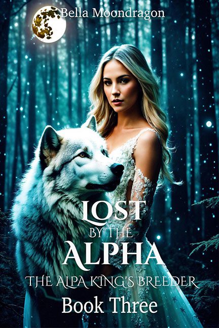
Paranormal romance covers are supposed to smolder with danger and allure. Lost by the Alpha instead smolders with… teal photo filters, mismatched stock images, and the faint whiff of a Windows XP wallpaper.
The heroine, posed front and center, looks like she just left a bridal magazine shoot. Her dress is sparkling, her hair is glowing, and her lighting says “outdoor wedding.” Drop her into a misty forest and suddenly she looks less like an alpha’s chosen mate and more like a bride who made a very wrong turn on the way to the reception hall.
And then there’s the wolf. Noble? Majestic? Maybe in its original wildlife calendar photo. Here, it’s just pasted beside her like a poorly house-trained groomsman. The shadows don’t match, the highlights don’t line up, and instead of primal bond, we get the vibe of “lady brings her husky to prom.”
The forest background isn’t helping. Bathed in a harsh teal glow, it looks like someone slapped a color filter over stock trees and called it a night. It’s supposed to be mystical. Instead, it’s giving screensaver energy.
Typography? As generic as the rest.
- LOST BY THE ALPHA dominates the middle with bold white serif letters, broken up by thin “BY THE” text that feels like a last-minute formatting accident.
- The Alpa King’s Breeder (yes, “Alpa,” not “Alpha”) sits underneath, glaring at us with typo energy strong enough to eclipse the moon.
- And then “Book Three” floats at the bottom in plain type, as if even the designer was tired by this point.
And let’s not forget the author logo: a glowing golden moon in the top corner that looks less like lunar mystery and more like clip-art pizza orbiting Earth.
The verdict? Lost by the Alpha is a howling mess. With its bridal stock model, calendar wolf, teal forest screensaver, and typo-riddled title, it’s not mystical or romantic — it’s just another tragic case of alpha design failure.
