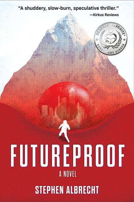
Speculative thrillers deserve sharp, striking covers that grab the imagination. Futureproof instead delivers a chaotic pile of design elements that look like they were pulled from three different stock image websites and glued together in Photoshop at 2 a.m.
Let’s start at the top. A big, bold mountain dominates the cover. Majestic? Sure. Relevant? Not really. Instead of futuristic intrigue, it looks like an outdoor gear catalog cover for REI. To “futurize” it, the designer decided to dump binary code across the whole thing in a shade of flat red, leaving us with the visual subtlety of a freshman graphic design project titled “The Matrix, but make it hiking.”
And then, in the middle, comes the glowing red orb. Is it a city dome? A portal? A ball of cranberry Jell-O? Who knows! The detail is so muddy it looks less like a mysterious futuristic element and more like a Windows XP screensaver that got corrupted.
Standing in front of this orb is a lone white silhouette. He’s supposed to represent isolation, scale, maybe humanity against the machine. Instead, he looks like a hiking trail icon from a bathroom door sign accidentally wandered into the artwork.
Typography doesn’t save the day.
- FUTUREPROOF is bold, yes, but squished into the bottom half where it has to fight with the orb and the stick figure for attention.
- A Novel is added, just in case you didn’t know what a book was.
- And the author’s name sits underneath, uninspired and detached, like an afterthought at the end of a messy email.
Finally, let’s not forget the shiny “Readers’ Favorite Award” medallion slapped in the top corner. It doesn’t blend, it doesn’t belong, it just shouts “Look! A sticker!” like a participation ribbon at a science fair.
The verdict? Futureproof tried to be sleek and futuristic but ended up as a mountain, a binary soup overlay, a Jell-O orb, and a lost bathroom-sign hiker all fighting for screen time. If this is the future, maybe we should stick with the past.
