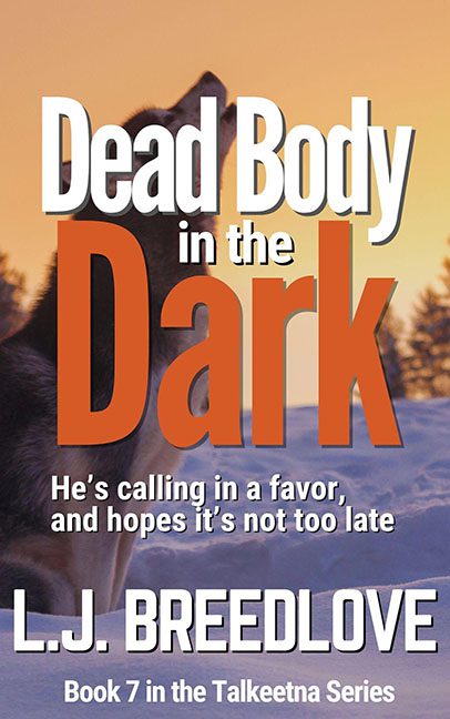
Somewhere deep in the Alaskan wilderness, a lone wolf howls in the snow… possibly in grief, possibly in artistic protest over being trapped under 14 layers of bad typography.
Welcome to Dead Body in the Dark, Book 7 in the Talkeetna Series, and Exhibit A in the ongoing trial of Text vs. Readability.
Let’s start with that title — if you can read it without your eyes going on strike, congratulations. “Dead Body” is presented in giant, bold white, “in the” has vanished into a sad, ghostly gray, and “Dark” is in burnt orange, because nothing says “dark” like… orange? Visually, it’s less mysterious thriller and more PowerPoint slide from a true crime convention held in a garage.
The font choice? Think brick wall, but make it text. There’s no elegance, no intrigue — just blocky sans-serifs elbowing each other in a frozen brawl. It looks like someone sat on the keyboard and said, “That’s legible enough.”
But wait, it gets better.
We’re treated to the tagline:
“He’s calling in a favor, and hopes it’s not too late.”
Which might be about the plot… or could be what the author whispered to a graphic designer who never actually showed up.
Now, let’s talk about our poor howling wolf/dog/stock-photo-mascot. Trapped in a snowy landscape and partially buried under the word “Dark”, it’s giving big “I was supposed to be the main character, but then the font attacked” energy. This image could’ve had potential — dramatic sunset, wilderness vibe, mystery atmosphere — but instead, it’s treated like wallpaper in a text-heavy phone memo.
And speaking of heavy: L.J. BREEDLOVE’s name is slammed across the bottom in all caps like it’s the answer to a very aggressive game show. No breathing room, no spacing finesse — just big white text on top of blue snow, asking for attention and forgiveness in equal measure.
To wrap it up, the series tag “Book 7 in the Talkeetna Series” is slapped on like a grocery store price sticker, because we clearly ran out of layout energy by that point.
They say don’t judge a book by its cover — but when the cover itself looks like it’s trying to escape the story, maybe it’s time for a design intervention.
