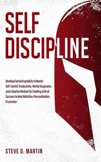
Here we have Self Discipline, a book that promises Spartan-level toughness but delivers design choices that look more like they were lifted from a corporate PowerPoint template titled “Motivation 101.”
The title itself is less a phrase and more a punishment. “SELF” is crammed on top of “DISCIPLINE” in a chunky, joyless font, forcing the words into formation like they’re being yelled at by a drill sergeant. It doesn’t communicate strength or wisdom. It communicates “default sans serif in 72pt because bigger = better.”
Then comes the subtitle wall. Instead of a sharp, memorable hook, we get a grocery list of every self-help buzzword known to humankind. “Develop Everlasting Habits to Master Self-Control, Productivity, Mental Toughness, and a Spartan Mindset for Creating a Life of Success to Beat Addiction, Procrastination, & Laziness.” That’s not a subtitle. That’s a run-on sentence with a superiority complex. By the time you finish reading it, you’ve lost all your productivity for the day.
Now, the visual metaphor. Yes, it’s a Spartan helmet. Because nothing says “self-discipline” like dressing your life advice in cosplay from 300. It’s a flat, blood-red vector graphic with a sprinkle of fake grunge texture, slapped awkwardly against the title like clipart left over from a CrossFit flyer. It doesn’t integrate. It doesn’t inspire. It just… sits there, glaring at you like a party mask from Party City.
The color palette? Red and white. That’s it. But instead of bold minimalism, it reads like a soulless gym poster: sterile, flat, and boring. There’s no tension, no creativity, no spark. Just angry red text screaming at you to do push-ups while the helmet judges your form.
This isn’t a cover about mastering yourself. It’s a cover about mastering Microsoft WordArt and then giving up halfway.
