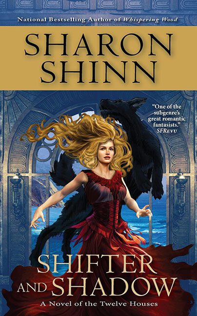
Some fantasy covers exude mystery and magic. Shifter and Shadow exudes hairspray and regret.
Our heroine arrives center stage with hair that deserves its own novel. It’s not flowing dramatically in the wind — it’s rebelling against gravity itself, exploding outward like she walked too close to a Tesla coil. Instead of sultry danger, it looks like a L’Oréal commercial set in Mordor.
Then we have the wolf. The mighty, shadowy beast, meant to symbolize primal ferocity, instead appears like it’s peeking over her shoulder to ask if she’s free for brunch. Its positioning makes it less terrifying predator and more clingy roommate photobombing the shot.
And let’s not ignore the pose problem. Our heroine is striding forward, but her arms are stiff, her torso rigid, and the whole effect screams “department store mannequin caught mid-shove.” Combine that with her thousand-yard stare and she’s less “fantasy heroine” and more “NPC waiting for dialogue options.”
The typography isn’t helping either. Up top, the author’s name looms in a giant beige banner that eats half the cover like a tyrant. Below, “SHIFTER AND SHADOW” is dropped in chunky serif font, complete with an overwrought ampersand that’s trying far too hard to impress. The fonts aren’t magical, mysterious, or even particularly legible against the chaos of the background — they’re just loud.
And oh, the color palette. Golden hair, crimson dress, blue-gray sky, black wolf, beige banner. It’s like five different paintings got collaged into one. No cohesion, no balance — just visual whiplash.
This cover wants to be brooding and romantic, but it’s pure camp — though not the fun, self-aware kind. The wolf looks embarrassed, the hair is auditioning for its own spin-off, and the typography is louder than the flames in the background.
This isn’t Shifter and Shadow. This is Hair and Photobomb.
