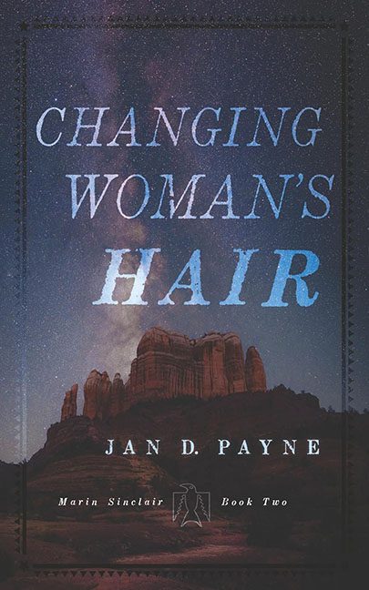
Every now and then a book cover doesn’t just confuse — it actively misleads. Enter Changing Woman’s Hair, which, from the title alone, sounds like it could be a memoir from your local stylist, a self-help guide to “finding yourself through bangs,” or maybe a cheeky novel about salon drama. Instead, we get… rocks. Just rocks.
The backdrop is Monument Valley at dusk, with a lovely spray of stars overhead. Beautiful, sure, but what in the shampoo aisle does this have to do with hair? The only possible link is if you squint at the Milky Way and imagine it as intergalactic split ends. Spoiler: it doesn’t work.
And then there’s the typography. Big, blocky serif letters scream “serious literary work” — until the designer decided to frost the word “HAIR” in icy blue, making it look like a rejected logo for Garnier’s “Milky Way Shine” conditioner. It doesn’t suggest myth or mysticism. It suggests product branding gone wrong.
To make matters worse, someone thought it was clever to add a stitched border around the whole cover, giving it a faint “Western romance” vibe. Then, because why not, a tiny cryptic silhouette was dropped near the bottom like a forgotten watermark. None of it ties together. None of it clarifies what this book actually is.
Instead of mystery, the cover gives us mixed signals. The title says hair. The image says desert postcard. The font says classic. The color choice says shampoo aisle. The overall effect? “We couldn’t decide, so we went with everything.”
This isn’t Changing Woman’s Hair. This is Changing Designer’s Mind — halfway through the project.
