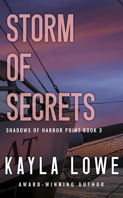
The title promises a Storm of Secrets. The cover promises a quiet evening cruise with complimentary Chardonnay. Somewhere between intent and execution, this design hoisted the wrong sail and drifted straight into the land of forgettable covers.
Let’s start with the photo. Yes, it’s a sailboat. Yes, there’s a sunset. And yes, it’s the exact same vibe you get when you Google “sailboat stock photo” and pick the first free one. It’s calm, it’s pastel, it’s serene. What it isn’t is stormy, dangerous, or secretive. If there are any secrets on this yacht, they’re about whether Karen remembered to pack enough hummus.
Now, the typography. “STORM OF SECRETS” is slammed across the top in giant, flat sans serif text, perfectly legible but devoid of atmosphere. It’s not mysterious, it’s not moody — it’s just… big. Worse, it cuts right across the rigging of the sailboat, so your eyes spend more time playing Where’s Waldo with the ropes than actually absorbing the title.
The author’s name doesn’t fare much better. “KAYLA LOWE” is blasted across the hull of the boat like a spray-painted tag. The bold white letters pop, sure, but not in a way that says “award-winning suspense.” More like “student project in Intro to Photoshop.”
And the tone? Completely mismatched. The words shout thriller, the imagery sighs relaxation. The title hints at buried lies, hidden danger, stormy truths — but the photo looks like the cover of Better Sailing Monthly.
This isn’t Storm of Secrets. This is Calm Evening with a Groupon Sunset Cruise.
