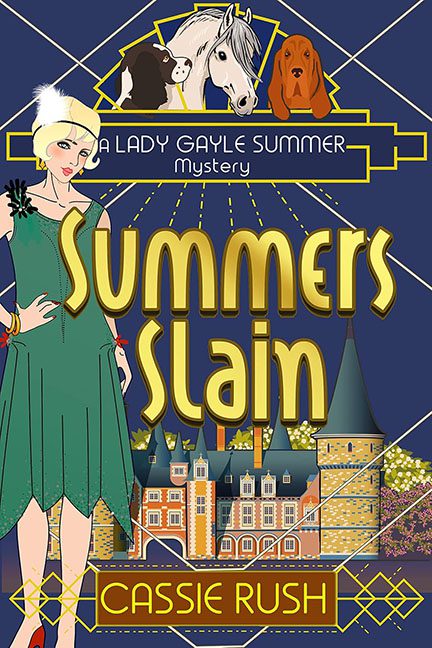
The roaring twenties gave us jazz, speakeasies, and Gatsby. Summers Slain gives us… clipart horses and a confused cocker spaniel.
Let’s start with the leading lady. Our flapper heroine stands front and center, drawn in a flat cartoon style that looks less “glamorous amateur sleuth” and more “free paper doll download.” She’s here to solve a murder, but with that dead-eyed stare and limp wrist pose, she looks more likely to lecture you on the importance of feather boas.
Above her floats a truly baffling panel: two horses and a dog, all cropped like they’re auditioning for the world’s saddest pet calendar. What role do they play in this murder mystery? Are they suspects? Witnesses? The murderers themselves? Whatever the intent, their placement makes them look like divine judges presiding over the case from the heavens.
And then there’s the backdrop: a photorealistic castle, painstakingly detailed, slammed right behind the cartoon flapper. The clash of styles is brutal. It’s like someone dropped a Scooby-Doo character into a tourism brochure. Add in some awkward golden spotlight rays that look like they were drawn with a mouse in PowerPoint, and the whole thing screams “scrapbook, but make it murder.”
Typography? Oh, it’s Art Deco — or at least, what your computer thinks Art Deco looks like when you pick the “Deco Party” font from a free site. “SUMMERS SLAIN” bulges awkwardly across the cover in gold block letters, more balloon animal than Jazz Age elegance. It wants to be classy, but it’s giving county fair poster.
The whole effect isn’t mysterious. It isn’t glamorous. It isn’t even camp. It’s just a chaotic mash-up of clipart flapper, tourist castle, and floating animal heads.
This isn’t Summers Slain. This is Design Choices Slain.
