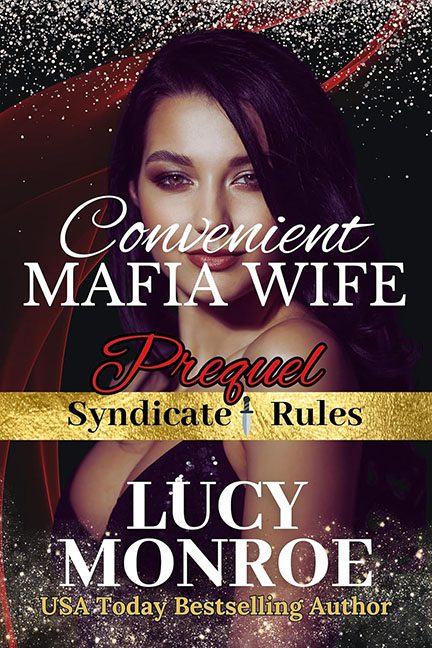
Nothing says organized crime quite like… five fonts, a glitter explosion, and a gold strip that looks ripped off a Hershey’s wrapper. Welcome to Convenient Mafia Wife, a cover that screams less “dark, dangerous mafia romance” and more “DIY Canva project at 2 a.m.”
Let’s start with the title. Convenient Mafia Wife. Convenient. Really? That makes it sound like you picked her up in the frozen aisle at Costco. “Two-for-one deal on mob spouses, expires Sunday.” Mafia romance is supposed to be intense, forbidden, dripping with danger — not… practical.
The typography is its own crime syndicate. We’ve got curvy white script for “Convenient,” bold serif shouting “MAFIA WIFE,” swirly red cursive for “Prequel,” fake embossed gold for “Syndicate Rules,” and then another serif for Lucy Monroe. Five fonts, four competing styles, all fighting for control of the family business. It’s not design — it’s a typeface turf war.
And then, the glitter. Oh, the glitter. Instead of exuding luxury or menace, it looks like someone dropped a craft store into a paper shredder and pasted the debris across the bottom. Add in the random red swooshes and that cheap digital sparkle overlay, and suddenly this isn’t mafia romance at all — it’s a rejected poster for RuPaul’s Drag Race: Mob Wives Edition.
The model herself? Gorgeous, sure. But she’s got nothing to do with anything. She could be selling perfume, luxury cars, or discount evening gowns. There’s no storytelling, no mafia flavor, not even a token pistol tucked in her sequined clutch. Just another stock model staring out like, “Really? This is the cover you put me on?”
This isn’t dangerous. This isn’t sexy. This isn’t mafia. This is glitter glue, gold WordArt, and bad font choices running their own crime family.
