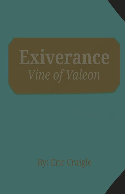
Every once in a while, a book cover comes along that makes you stop and ask, “Wait… is this the final draft?” Exiverance: Vine of Valeon is one of those covers. It’s less “professional book design” and more “student project abandoned halfway through because the Wi-Fi went out.”
The first thing that leaps — well, more like stumbles — at you is the color scheme. A teal background paired with a sad, muddy brown rectangle for the title. Not dramatic. Not striking. Just the visual equivalent of oatmeal left too long on the stove. And speaking of the title, “Exiverance” is printed in a gray so faint it looks like the printer cartridge was gasping its last. The subtitle, Vine of Valeon, is even fainter, as if it’s quietly excusing itself from this mess.
Then there’s the typography. Minimalism can be sleek, but here it looks more like a formatting error. The fonts are so generic and so poorly placed they give off “middle school PowerPoint” energy. And don’t miss the little corner of black in the bottom right — a random diagonal slice that feels less like an artistic choice and more like someone leaned on the shape tool by mistake.
Finally, the author’s name. By: Eric Craigle is shoved at the bottom in orange text that clashes with everything else. The “By:” is especially egregious — no one told this cover that authorship credits don’t need to look like the title page of a high school essay.
Altogether, Exiverance: Vine of Valeon isn’t just a cover fail — it’s a cover that looks like it failed to even show up for class. Minimalist design is an art form. This is not that art form. This is minimal effort.
