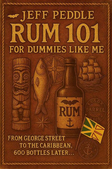
Ahoy, sailors of design disaster — today we’re cracking open a bottle of pure cover chaos: Rum 101 for Dummies Like Me. And trust me, this thing looks less like a book and more like a souvenir coaster you’d pick up in a Caribbean dive bar after one too many.
At first glance, you’re hit with an endless wave of brown. Not golden rum-brown. Not rich mahogany-brown. Just the same flat, lifeless shade, as though someone spilled a vat of watered-down sepia ink over the entire project. Instead of vibrant fun, we get the aesthetic of a sun-dried treasure map that no one wanted to find.
Then there’s the visual buffet of randomness: a tiki statue, a fish, a compass star, a rum bottle, a ship, and a flag. What ties them all together? Nothing. It’s like a design scavenger hunt where the artist just slapped in anything remotely nautical or “Caribbean-ish” without thinking. The tiki alone looks like it was borrowed from a 1960s backyard luau party.
The typography? Bold, sure — but bold doesn’t equal good. The title Rum 101 for Dummies Like Me is jammed into the top like it’s carved into the lid of a barrel, but the complete lack of contrast means it blends right into the background. And that subtitle — From George Street to the Caribbean, 600 Bottles Later… — only adds to the confusion. Is this a memoir? A travelogue? A drinking log? A cry for help?
Finally, let’s talk about tone. A book about rum should feel fun, lively, maybe even a little dangerous. This cover, instead, feels dead on arrival. It’s flat, muddy, and weirdly depressing.
This isn’t Rum 101. This is Hangover 101.
