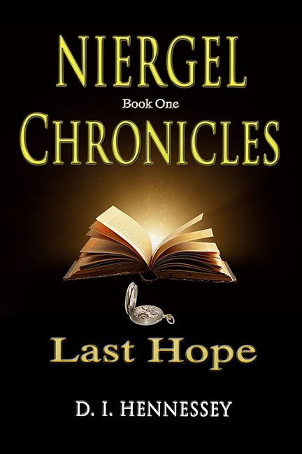
Well, here it is — a shining example of how to make your fantasy novel look less like an epic saga and more like a high school PowerPoint presentation.
The glowing book at the center could have been interesting if it weren’t so obviously a stock photo just dumped onto a flat black background. There’s no blending, no context, no sense of place — just a book floating in a void like it’s trapped in some budget version of The Twilight Zone.
And then there’s the pocket watch. Why is it there? What does it mean? Was it accidentally dragged onto the canvas and the designer decided to just leave it? It sits awkwardly under the book like a forgotten prop from another cover entirely.
Typography? Don’t get me started. The word “Chronicles” takes up so much space you’d think that was the actual title, while “Niergel” — the unique part of the name — looks like a timid sidekick. And the choice of glowing yellow text on pure black? It’s less “fantasy adventure” and more “church newsletter circa 1997.”
If the goal was to inspire hope, mission failed. What we’ve got here is a “last hope” for a cover that desperately needs to be reimagined.
Verdict: A fantasy cover lost in the void of clipart purgatory.
