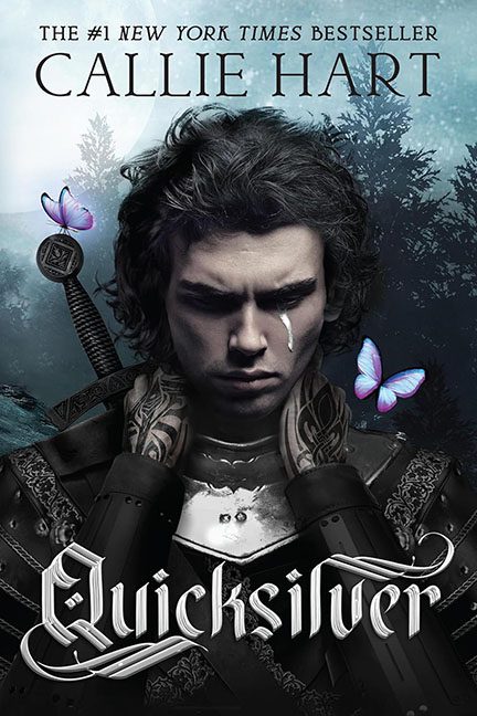
Sometimes a cover tries so hard to be serious and dramatic that it loops all the way back around to being unintentionally hilarious. Quicksilver by Callie Hart is exactly that kind of cover.
First, let’s talk about the main character. He looks like he’s auditioning for a medieval boy band called The Brooding Swords. With his furrowed brows and a single glowing anime tear rolling down his cheek, we’re meant to feel his deep, tortured soul. Instead, we’re wondering if he just lost his favorite eyeliner pencil.
Then we get the color scheme. Everything is black, white, and gray — moody, gritty, full of shadows… until the neon butterflies show up like they escaped from a Lisa Frank trapper keeper. It’s as if the designer couldn’t decide between “dark fantasy romance” or “psychedelic butterfly sanctuary” and just said, “Why not both?”
And oh, the typography. That swirly pseudo-metal band font looks like it was lifted straight from a 2003 free download site. It’s not complementing the art; it’s fighting against it for attention, like a drunk uncle at a wedding trying to sing karaoke over the actual band.
The result? A cover that wants to scream “epic fantasy romance with gravitas” but instead whispers, “I’m edgy, but also… sparkly?”
Verdict: A tragic knight with a glitter tear, photobombed by rave butterflies, wrapped in typography that should have stayed buried in the early 2000s. Truly, a horrible cover.
