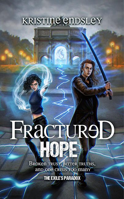
There’s a special place in the digital underworld where rejected MMORPG character renders go to sulk—and apparently, it’s the cover of Fractured Hope. Two moody models pose in what can only be described as a magical parking lot outside the Arc de Generic, armed with glowing weaponry and unrelenting blank stares. This isn’t epic fantasy, it’s Photoshop’s “smudge tool” auditioning for a Broadway show.
Let’s start with the title treatment. “FractuʀeD HOPE” looks like a broken CAPTCHA test trying to get into an escape room. Someone clearly thought mixing upper- and lowercase with a misplaced gamma symbol (or is that just a tragically stretched R?) would look futuristic. Spoiler: it doesn’t. It looks like typography caught a virus.
The cover’s overall color palette is stuck in “Overwrought Blue,” a shade commonly used by early 2000s fan edits and people who think lightning effects equal tension. And speaking of lightning—what is happening with that glowing crack in the ground? Is it a tear in reality? A magical road? A deeply confused sidewalk installation? We may never know.
The female lead seems to be summoning the power of electrostatic laundry cling, while her brooding sword-wielding partner glares ahead like he just realized this is his author photo. They both radiate the charisma of mannequins doing a promo for Fantasy Gap.
And then, there’s the tagline: “Broken trust, bitter truths, and one crisis too many.” Honestly, that’s also a decent summary of the design process behind this cover.
This isn’t a book cover—it’s a cautionary tale in JPEG form. And somewhere, a graphic designer is screaming into a void made entirely of outer glows and drop shadows.
