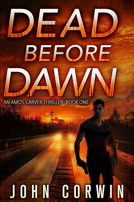
Somewhere in the deepest recesses of a Photoshop tutorial gone wrong, Dead Before Dawn was born. It emerged fully loaded with lens flares, flaming gradients, and a guy holding a gun like he’s ready to star in Die Hard: The Free eBook Version. If you’ve ever wondered what it would look like if an action movie trailer had a fever dream, this cover is your answer.
Let’s begin with the title font, which is absolutely screaming—and not in a cool way. DEAD BEFORE DAWN is emblazoned across the sky in a metallic orange gradient so loud, it could blind a satellite. It’s been bevelled, shadowed, and stretched like it’s auditioning for the role of “Text Layer Most Likely to Appear on a Monster Energy Ad.” The kerning is chaotic. The alignment? Not even trying. It’s typography by way of panic.
Below this glowing apocalypse of text stands our mysterious tough guy, a silhouette so deeply shadowed that even his personality couldn’t survive the exposure settings. He’s holding a gun (obviously), brooding (naturally), and glowing just enough around the edges to suggest he’s standing a little too close to a radioactive toaster oven. His anatomy is suspicious, his stance is rigid, and his entire vibe is “This is my default stock pose and I am contractually forbidden from expressing emotion.”
Then there’s the bridge to nowhere—a glowing wooden pier that seems to be leading directly into the sun. Or maybe a fire. Or possibly the Photoshop light source named “Overkill v3.” The sky is blazing orange, the reflection is searing, and somewhere off in the horizon, color theory is quietly weeping.
What’s most alarming is the lack of depth. The background has the depth of a cardboard diorama, and the visual tension is completely undermined by the fact that the character looks like he was pasted in as an afterthought. Honestly, he’s one “drag-and-drop” away from falling off the cover entirely.
And of course, in case you thought there might be mystery left, we’re told this is “An Amos Carver Thriller”—which sounds suspiciously like the name of a guy who reviews tactical flashlights on YouTube. The subtitle is squished in like an apologetic whisper under the screaming main text, as if it’s trying to escape the burning font above it.
Dead Before Dawn is trying so hard to be intense, but ends up looking like the DVD cover of a film that went straight to bargain bin. It’s not thrilling—it’s thermonuclear. And not in a good way.
