Piccadilly Publishing is back at it again, reminding us that when authors run their own publishing company, you don’t always get creative freedom—you sometimes get graphic design held hostage by clipart and cowboy clichés.
Four Graves in Shiloh tries very hard to be gritty, but what we actually get is a cover so confused it looks like it wandered straight out of a bad Red Dead Redemption mod. Let’s unpack this visual rodeo:
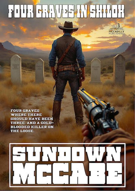
Front and center, our cowboy hero is standing with his back to us, brooding toward four tombstones that appear to have been copy-pasted from the same Photoshop gravestone pack. Instead of ominous, it looks like he’s staring at a catalog display: “Here’s our medium-sized model, perfect for prairie funerals, buy three, get one free.”
But the real gem here is the mystery gun. Floating in the bottom corner, a hand juts out pointing a revolver—not at the cowboy, not at the graves, but at us, the readers. It’s not menacing; it’s confusing. Whose hand is this? Is it a giant? Is it a tutorial pop-up for “How to Aim in First-Person Shooters”? The perspective is so bad it turns the whole cover into an accidental parody.
Typography? Piccadilly did what Piccadilly always does—choose the loudest fonts available and crank them up to 11. FOUR GRAVES IN SHILOH is stamped across the top like a demolition notice, while SUNDOWN MCCABE at the bottom screams like it’s headlining a WWE match. Subtle design doesn’t exist in this publishing house—only fonts that punch you in the face.
And then we have the tagline: “Four graves where there should have been three. And a cold-blooded killer on the loose.” A decent pulp hook! But where did they put it? Randomly beside the cowboy’s thigh, as if it were embroidered on his jeans. That’s not design—it’s accidental graffiti.
The whole thing reeks of Piccadilly Publishing’s house style: throw together stock images, stencil fonts, and pulp slogans until it vaguely resembles a book cover. The result? Not menace. Not western grit. Just bargain-bin chaos in a cowboy hat.
