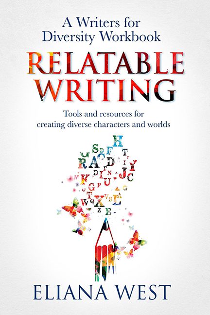
Some book covers hit you with wolves, glowing orbs, and smoldering billionaires. Relatable Writing takes a different path — it bores you to death with the energy of a corporate training manual someone forgot in the break room.
Let’s start with that title treatment. “Relatable Writing” is supposed to pop, inspire, and radiate creativity. Instead, it’s red-to-black gradient WordArt, the kind of effect you’d find in PowerPoint 2003. It doesn’t shout “diverse characters and worlds.” It sighs “quarterly sales report.”
The star of the show, though, is the pencil vomiting alphabet soup. It’s clearly meant to symbolize language bursting into vibrant creativity, but what it actually resembles is a preschool craft project after snack time. Letters fly off in random directions with no rhyme or reason, and the result looks less like diversity and more like someone sneezed in Scrabble.
The background? Blank white. Not clean minimalism, but sterile void. It screams “template,” the kind of off-the-shelf workbook design you could swap the title out on and suddenly it’s Excel for Dummies or Mindful Budgeting. For a book about creativity and world-building, this is criminally uninspired.
And of course, we can’t ignore the subtitle zone: “Tools and resources for creating diverse characters and worlds.” All presented in a polite little serif font, like a legal disclaimer at the bottom of an ad. If you squint, you can almost hear a monotone voice reading it aloud over elevator music.
The real tragedy here is the mismatch between subject and execution. A workbook on diversity and creativity should feel alive, dynamic, exciting. Instead, this cover delivers the raw charisma of a packet handed out at a “Cultural Sensitivity Training” workshop in conference room B.
This isn’t Relatable Writing — this is Forgettable Cover Design.
