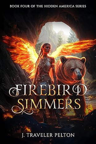
This appears to be a good attempt, but you will notice a lot of issues.
- Shadows are all wrong
- The light coming in from the mouth of the cave is not creating correct shadows.
- The wings are on fire, which would create more shadows across the bear and main character.
- The light of the flaming wings would also remove the internal shadows inside the cave.
- Left Wing Down
- The left wing is only partially made to accommodate the bear, who is well behind the main character. The wing would be hiding the bear, which is why they left it out. Artistic failure.
- Right Wing Curving
- Notice how the right wing’s upper curve matches the mouth of the cave? A 100:1 shot!
- Clashing Colour Temperatures
- There are competing light sources-orange firelight, daylight, and the glowing wings. It’s chaotic rather than cohesive.
What Could Have Worked Better?
-
Focus on One Element:
Either highlight the warrior or the bear—or choose a symbolic firebird element (like glowing feathers or embers)—but not all three at once. -
Tone Down the Background:
Use depth and selective blur to make the central figure pop while keeping background elements supportive, not competitive. -
Simplify the Typography:
A cleaner, bolder font for both the title and author name would improve readability, especially at thumbnail scale. -
Genre Clarity:
A potential reader should immediately know: Is this paranormal? Fantasy? Adventure? Romance? Right now, it’s visually confused.
