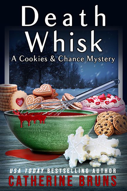
Cozy mysteries often live in that sweet spot where cupcakes meet corpses, but Death Whisk’s cover looks like it couldn’t decide whether it was auditioning for The Food Network or an episode of CSI. We’ve got a giant whisk, jammed into what appears to be a bowl of radioactive red goo that’s supposed to be “blood batter” but looks more like someone spilled a bottle of Sally Hansen nail polish into their Christmas cookie dough. Nothing says “murder mystery” like a cover that makes you wonder if tetanus is on the menu.
The cookies scattered around the bowl look like they were pulled from three different stock photo catalogs. We’ve got gingerbread hearts frosted within an inch of their lives, Pinterest-worthy snowflakes, and a lone chocolate chip cookie photobombing the crime scene. It’s less “baking clue” and more “graphic designer’s cookie clipart folder exploded.”
Then there’s the background: a dark and moody forest peeking through a window, which might have worked if the cookies weren’t lit up like they’re starring in a Pillsbury Christmas commercial. The vibe is supposed to be sinister, but instead we’re stuck in a weird in-between world where the Great British Bake Off has taken a sharp left turn into blood-spatter analysis.
And let’s talk about the typography. “Death Whisk” is stamped across the top in a serious, almost Nordic crime-drama font. It’s bold, it’s menacing, it’s… wildly out of sync with the frosted sugar cookies underneath. The result feels like Jo Nesbø wandered into Betty Crocker’s kitchen and no one had the heart to stop him.
Catherine Bruns may be a USA Today bestselling author, but this cover proves that sometimes even the bestselling can fall victim to death by graphic design.
