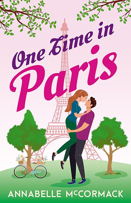
If romance is supposed to sweep you off your feet, One Time in Paris looks more like it tripped over a tourist brochure and landed face-first into a free clip art library. This cover tries so hard to whisper “Parisian love story” but ends up screaming “Microsoft Publisher, circa 2003.”
Let’s start with the Eiffel Tower. It isn’t an icon of romance here—it’s a faint, washed-out watermark in the background, as though the designer couldn’t afford the rights to a stock photo and decided to fade it into irrelevance. Meanwhile, our star-crossed lovers in the foreground look less like they’re in a passionate embrace and more like he’s politely catching her after too many glasses of boxed rosé. Their bodies have all the heat and chemistry of cardboard cutouts taped together.
The color palette doesn’t help either. Bubblegum pink bleeds into Pepto-Bismol territory, coating the entire scene in an aggressively saccharine tone that makes the eyes twitch. Cozy romance? Sure. Believable romance? Not when it looks like two Sims characters glitched into a hug animation.
And then there’s the bicycle. The lonely, random bicycle under the tree is less “romantic getaway” and more “oops, we borrowed this from a Dutch travel poster.” It doesn’t belong, it doesn’t add, it’s just… there. Like an extra prop the designer didn’t have the heart to delete.
One Time in Paris could have been swooning romance. Instead, it’s clip art cosplay with bad font choices. Paris deserves better. Romance readers deserve better. And bicycles definitely deserve better.
