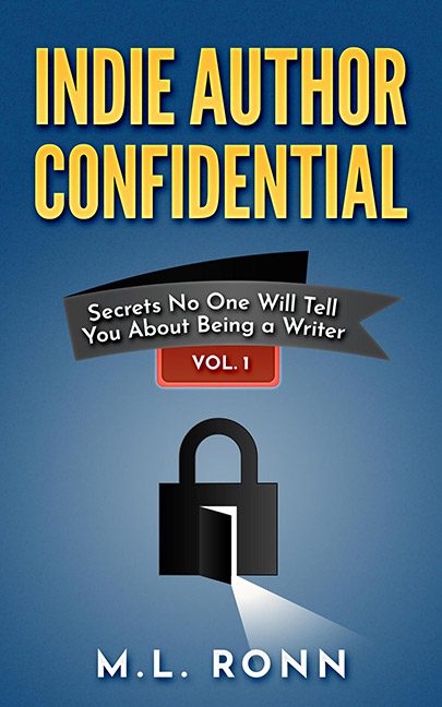
Some covers whisper. Some covers shout. And then there’s Indie Author Confidential, which pulls you aside in the darkest corner of a Barnes & Noble bargain bin and mutters, “Psst… wanna see my clip art collection?”
Where to begin with this beauty? The padlock. Yes, the symbol of mystery, of secrecy, of protecting your darkest authorial truths. Except here, it looks like the padlock emoji got promoted to graphic design duty and was dropped onto the cover with all the subtlety of a WordArt explosion. It’s flat, lifeless, and radiates the artistic energy of a Windows 98 security update. And the beam of light shooting from it? Apparently, that’s where the real secrets live. Sorry, padlock—you’re not concealing anything; you’re just screaming, “I was made in PowerPoint.”
Then there’s the background. A gradient blue. Nothing says “confidential” like the same color scheme you’d find behind your 5th grade school photo. Combine that with yellow block letters, and you’ve basically recreated the opening screen of a VHS safety training video.
The subtitle lives on a ribbon banner. A ribbon! Which looks less like a sleek design choice and more like the sad leftover element from an early 2000s Geocities website. And smack in the middle: “VOL. 1.” Not a promise, not a treat, but a threat. There’s more where this came from.
Altogether, this cover doesn’t feel confidential. It feels like the art department locked the budget in a vault and threw away the key. If the goal was to tell us how not to design a book cover, congratulations—mission accomplished.
If you’ve ever wondered what clip art dreams about when it closes its eyes, it probably looks exactly like Indie Author Confidential.
