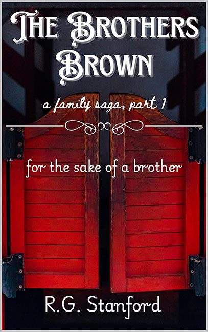
Some covers whisper “family saga.” Some declare “Western epic.” The Brothers Brown stands awkwardly in the middle of a dusty road shouting, “I’m not sure what I am, but I definitely found this font online for free!”
The scene is simple — two red saloon doors. That’s it. That’s the whole cover. No characters, no landscape, no hint of story — just the entryway to what looks like a mid-tier barbecue joint. It’s less “dramatic family saga” and more “Come on down to Brother Brown’s Ribs and Regrets!” If you squint, you can almost see the lunch specials written in chalk just off-frame.
Now, about the typography — because, oh, does it demand attention. “The Brothers Brown” is dressed up in a hyper-stylized Old West font that’s doing the visual equivalent of shouting “Howdy!” in your face. Right beneath it, “a family saga, part 1” appears in a dainty script font that looks like it came from a wedding invitation. And sandwiched in the middle, “for the sake of a brother” appears in yet another font, plain and unstyled, like it wandered in from a completely different book and decided to stay out of pity.
Three fonts, no hierarchy, zero chemistry. It’s like the designer held a font family reunion and forgot to set ground rules. The result: pure typographic anarchy.
The composition itself feels less designed and more assembled in haste. The photo background has the overexposed sheen of a phone pic run through a “drama” filter three times. The decorative flourish dividing the text sits there nervously, unsure if it’s supposed to add elegance or just kill time. The author’s name at the bottom — R.G. Stanford — floats in a white serif font like a timid afterthought, as if even it doesn’t want to be associated with this red door fiasco.
Let’s also talk tone, because the mixed signals are staggering.
The Western font screams “gunfight.”
The script tagline whispers “emotional journey.”
The subtitle, for the sake of a brother, sounds like a Hallmark adaptation of an episode of Yellowstone.
It’s a genre identity crisis in real time.
If The Brothers Brown is meant to be an epic saga, this cover feels more like the opening act of a PowerPoint presentation about rustic font options. It’s not bold, it’s not cohesive, and it’s definitely not selling whatever story it’s supposed to tell.
This isn’t a family saga — it’s a family font feud.
And if we’re being honest, the only thing this cover truly unites is confusion and regret.
