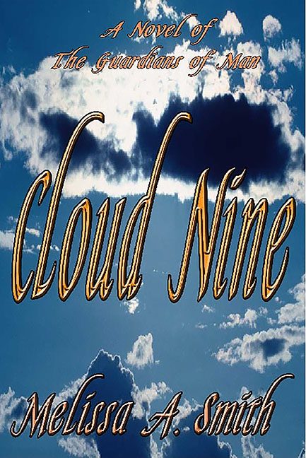
Every so often, a cover comes along that makes you stop, stare, and whisper softly, “Ah, 2003. We meet again.” Cloud Nine by Melissa A. Smith is one such time capsule — a masterpiece of early-Internet design optimism where bevels were bold, gradients were godly, and every cloud was a creative choice waiting to happen.
Let’s begin with that background. It’s just… sky. Not a dramatic sky. Not a celestial sky. Just a slightly overexposed photograph of some clouds that look like they were pulled from a Windows XP desktop wallpaper named “peaceful_day_003.jpg.” The composition is nonexistent — no horizon, no texture, no depth. It’s as though someone stared at the heavens and said, “Perfect. That’s my protagonist.”
And then the text arrived. Oh, the text.
“Cloud Nine” floats in the middle of the image in a molten gold WordArt font that could blind a medieval knight. It’s shiny, it’s 3D, and it’s outlined in what appears to be… more gold. The beveling effect is so extreme it looks like the title’s trying to escape the book entirely. Each letter glows with the hubris of someone who just discovered Microsoft Publisher and decided to never look back.
Above it, we find “A Novel of The Guardians of Man” — a phrase that promises sweeping mythological grandeur but is delivered in a weak, italicized script that looks like it was typed mid-yawn. It’s floating near the top like a reluctant subtitle that knows it doesn’t belong here but is too polite to leave.
Then, just when your eyes start to recover, you find the author’s name. “Melissa A. Smith” in the same metallic font, smaller but just as committed to its gold-plated glory. The entire composition gives the distinct impression that someone discovered the “WordArt 3D” button and immediately achieved enlightenment.
The color palette doesn’t help. Blue sky. White clouds. Orange-gold letters. It’s like a heavenly accident between a church bulletin and a casino marquee. The visual hierarchy? Nonexistent. The contrast? Questionable. The readability? Depends on your sunglasses.
Genre-wise, Cloud Nine declares itself as “A Novel of The Guardians of Man,” which implies something epic — divine forces, cosmic struggles, destiny itself. And yet the cover looks like a brochure for a motivational seminar titled “Soaring Toward Success!”
It’s not just bad. It’s anachronistically bad. The kind of bad that makes you nostalgic for dial-up internet and clip art CDs.
This isn’t Cloud Nine.
This is the storm front that canceled Cloud Nine’s flight.
If you listen closely, you can almost hear the cover whisper, “Designed on a Gateway computer, saved proudly as ‘final_final_use_this_one_2.jpg.’”
A design relic from a simpler time — when all you needed to make a book “pop” was a JPEG of the sky and enough beveling to qualify as sculpture.
