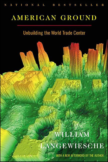
Some covers try to tell a story. American Ground tries to tell a data set.
Here it is — a neon-green, heatmap-from-hell rendition of what looks like either downtown Manhattan or the sonar scan of a coral reef. For a book with the subtitle “Unbuilding the World Trade Center,” this cover doesn’t just miss the emotional mark — it misses the planet.
The idea was probably noble: show the topographical complexity of Ground Zero as a scientific landscape. But the result looks like something a fisherman would stare at while waiting for a bite. You could slap a “Depth: 37ft” label on this image and no one would question it.
And that’s before we get to the text.
The title, American Ground, is readable enough, sitting in bold yellow at the top like a student project that just discovered “contrast.” But the subtitle — “Unbuilding the World Trade Center” — sits in thin red font directly on top of a radioactive green skyline, producing the kind of eye strain optometrists warn you about. The red-on-lime combo is basically a dare: “How long can you stare at this before your retinas file for divorce?”
Then there’s the tiniest of tiny lines at the bottom: “With a new afterword by the author.” Except you wouldn’t know that unless you’ve been blessed with hawk vision or a magnifying glass from the Smithsonian archives. It’s there, faint and ghostly, trying to survive against a background that eats text for breakfast. It’s not a design choice — it’s an extinction event.
The overall tone is another strange experiment. The book is about the aftermath of one of the most sobering events in American history, and the cover… looks like it’s advertising Volcanoes of Mars: An Illustrated Atlas. There’s no emotional weight, no sense of reverence — just a strange, buzzing, pseudo-digital abstraction that feels as detached as a PowerPoint slide at an engineering conference.
It’s one of those rare covers that manages to look both intelligent and deeply confused. You can tell someone thought, “Let’s be bold! Let’s be modern!” and then forgot to ask, “Does this look like a radioactive ant farm?”
If the goal was to visualize the “unbuilding” of Ground Zero, this design succeeded in unbuilding its own message. The color palette devours the typography, the typography ignores the hierarchy, and the hierarchy gave up and went home.
American Ground isn’t the worst cover we’ve seen — but it’s definitely the most baffling attempt at sincerity via science experiment.
It’s a lesson in restraint: sometimes, honoring a heavy topic doesn’t require data visualization. Sometimes, all it takes is clarity — and maybe not making your book look like a submarine radar screen.
