Every once in a while, a cover comes along that captures the true spirit of corporate despair so perfectly you almost have to respect it. The Auditors isn’t just a bad cover — it’s a visual audit of everything wrong with self-published design.
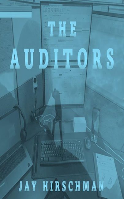
Let’s start with the obvious: this cover was taken with what I can only assume is a cell phone camera, possibly mid-yawn. The image is an unfiltered glimpse into a cubicle — the gray fabric walls, the tangled wires, the dual monitors full of spreadsheets, and the faint smell of reheated leftovers that somehow seeps through the screen. It’s not staged, stylized, or thematic. It’s literally just… an office.
And right there, plain as day, is the reflection of the photographer. A ghostly silhouette hovering in the glass like the spirit of burnout itself. You can see the arm raised, camera in hand, as if to say, “Yeah, this’ll do.” It’s like The Blair Witch Project: Payroll Edition.
The entire image is drowned in a blue filter, maybe to create atmosphere, but it ends up making the scene look like a still frame from an underwater security cam. This isn’t moody; this is the visual representation of oxygen deprivation.
The typography only deepens the tragedy. “THE AUDITORS” is slapped across the middle in a bold serif font that might’ve been pulled from Microsoft Word’s 1998 template pack. There’s no hierarchy, no rhythm, no tension — just text floating in the void, unsure whether it’s part of a thriller, a business manual, or a PowerPoint about tax compliance.
And that subtitle — oh wait, there isn’t one. But you don’t need one. The cover already tells you everything: fluorescent lighting, ergonomic keyboards, and the slow death of joy.
The composition is chaos. Wires snake across the desk, a headset dangles from the divider, and the monitor displays are partially visible, filled with unidentifiable spreadsheets. It’s cluttered, confusing, and utterly devoid of focus. The human brain looks for meaning — but here, meaning clocks out early and goes home.
Then there’s the color palette: monotone blue on blue. It’s as if the designer thought, “What emotion says ‘audit’? Depression.” And they were right. This is depression’s official RGB code.
It’s the rare cover that tells a story without meaning to — the story of a late afternoon, a bad coffee, and a looming deadline. You can feel the fluorescent hum. You can hear the quiet despair of a printer jam in the distance.
If The Auditors is meant to be a thrilling dive into bureaucratic tension, this cover delivers… just not the kind it wanted. The tension here is whether the office mouse will finally break the monotony and leap off the desk.
This isn’t just a bad design — it’s corporate nihilism turned into JPEG form.
A self-portrait of paperwork hell. A cubicle crime scene.
The only thing missing? A sticky note that says, “Fix later.”
