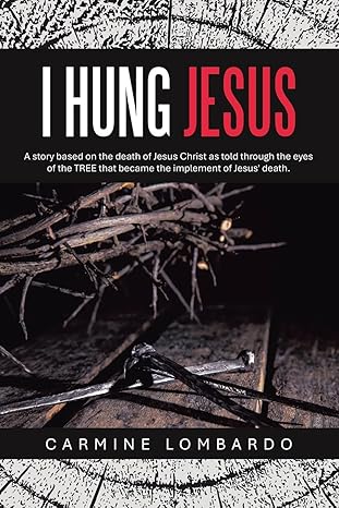
Today’s cover brings us to a perfect storm of poor design choices meeting unfortunate titling.
Let’s break it down…
What Went Wrong?
- Title Shock Factor (But Not in a Good Way):
“I Hung Jesus” is clearly meant to be provocative, but without immediate context, it comes across as blunt and potentially offensive. In a thumbnail or search result, you don’t see the small subtitle.
Most viewers won’t realize it’s anthropomorphism from the perspective of the tree used for the crucifixion. - First impressions matter, and this title without context feels jarring and misleading.
- Unreadable Subtitle:
The tiny subtitle holds the necessary clarification:
“A story based on the death of Jesus Christ as told through the eyes of the TREE that became the implement of Jesus’ death.”
But at any normal viewing size (especially thumbnail), it’s way too small to read. That key information never gets seen. This is a type setting nightmare.
- Typography Choices (Misfires):
The red-and-white-on-black title treatment feels like it belongs on a true crime book, not a religious or historical narrative.
Also, placing the author’s name in a reverse color bar (white on maroon) at the bottom just creates visual disjoint from the rest of the layout. - Boarder Issues:
Authors should beware that boarding the main image of a book cover limits the visual impact. But to also add black boarders shrinks the usable area used to grab the reader. - Image Confusion:
A dark pile of sticks and rusty nails may have symbolic meaning, but visually, it lacks emotional impact and narrative clarity.
A reader unfamiliar with Christian symbolism might just think it’s random debris. - Distracting Border Texture:
The cracked wood border effect around the top and bottom adds clutter without helping the composition. It fights for attention and pulls the eye away from the center.
What Could Have Worked Better?
- Title and Subtitle Relationship:
Either change the title to something less out-of-context shocking, or bring the explanatory subtitle up in size and placement so it travels with the title. - Image Choice:
Use clearer, emotionally resonant imagery–perhaps a stylized silhouette of a tree, a sunset, or symbolic wood grain with a crown of thorns–something more thematic and less literal. - Typography for the Genre:
Opt for classic, solemn serif fonts that suit religious historical fiction or theological narrative. Stay away from bold crime-novel aesthetics. - Simplify the Design:
Ditch the cracked wood texture border unless it can serve the story visually. Less clutter = stronger messaging.
Final Verdict:
This cover tries to balance shock value with spiritual meaning, but it ends up confusing, unreadable, and tonally inconsistent.
A book dealing with something as emotionally charged as the crucifixion deserves a cover that invites thoughtful reflection—not instant discomfort and confusion.

