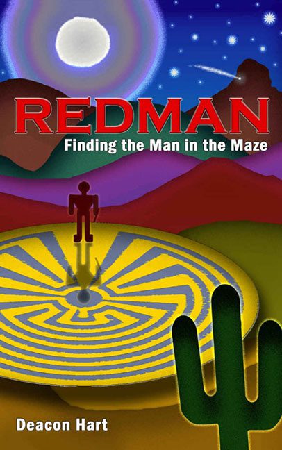
There are book covers that whisper their themes through subtle design, carefully curated colors, and elegant typography. And then there’s Redman: Finding the Man in the Maze — a cover that kicks down the door, dumps a box of mismatched gradients on your floor, and yells, “I found Microsoft Paint, and I’m not afraid to use it!”
The concept might have started with noble intentions: a spiritual journey, an ancient symbol, the idea of searching for meaning in a vast and mysterious world. But what we ended up with looks more like a middle school computer lab assignment titled “Things I Can Make With The Fill Bucket.”
Let’s begin with the maze — or what I assume is the maze. It’s a circular swirl of bright yellow lines on a radioactive mustard base, glowing like it’s about to open a wormhole to another dimension. Our hero, the “Redman,” stands at its center, rendered in deep crimson tones that make him look less like a mythic figure and more like a claymation figurine who’s been microwaved for 30 seconds too long. His shadow extends dramatically, but not quite in the right direction, suggesting that the laws of lighting bowed out early in the design process.
Hovering behind this chaotic labyrinth is a desert landscape painted entirely in gradients. The mountains are a surreal mishmash of orange, purple, and green — as if the artist asked, “What if Sedona was on another planet?” The night sky above is a carnival of competing colors: a giant moon, a scattering of stars, a random burst of light streaking diagonally for no clear reason, and the faint suggestion of cosmic regret.
And then — the cactus. A lone, vector-drawn cactus looms in the foreground, flat as a cardboard cutout and twice as awkward. It’s the only thing in the composition with a distinct outline, as though it was copied from ClipArt 2003 and dropped into the middle of a completely unrelated scene. Its placement screams, “This design needs something in the corner,” and that something, apparently, was a plant.
The typography is the final frontier of confusion. “REDMAN” is delivered in aggressive, all-caps bold red, casting a shadow so harsh it might qualify as its own character. Below it, the subtitle, Finding the Man in the Maze, is in plain white, like it’s trying to distance itself from the chaos above. The author’s name, meanwhile, sits quietly at the bottom in a soft yellow font, seemingly praying no one notices it.
What truly seals this as a hall-of-fame horrible cover is its utter lack of harmony. Every design choice looks like it was made in isolation — the maze from one program, the man from another, the background from a motivational poster, and the text from a cereal box. It’s like four different people made their own idea of what the book should look like, and rather than choosing one, the designer said, “Yes. All of them.”
If this cover were a maze, there would be no exit — only a loop of color clashes, distorted perspectives, and lost ambition. It’s an optical paradox where sacred symbolism meets Windows 98 aesthetics, and neither survives the encounter.
In short, Redman: Finding the Man in the Maze doesn’t just fail to find its man — it loses its artistic direction, sense of proportion, and dignity along the way. Somewhere in that glowing vortex, the poor man in the maze is still wandering, searching desperately for a graphic designer.
