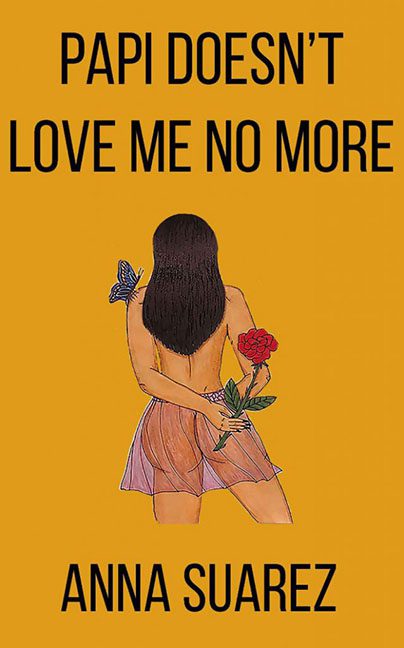
Ladies and gentlemen, gather ’round for a visual heartbreak so profound, it forgot to consult a graphic designer before airing its emotional laundry. Papi Doesn’t Love Me No More dares to ask the question: what if we put a breakup, a butterfly, a rose, and a backless dress into MS Paint, then called it a book cover?
Let’s start with the emotional core of this catastrophe: the girl. Drawn in what I can only assume is colored pencil scanned at low resolution, she stands with her back to us, clutching a red rose like it’s a hostage and she’s negotiating with the concept of dignity. Her left hand, lovingly overextended like a spaghetti noodle in distress, dangles the flower in a manner that screams “symbolism!” while the butterfly perches on her shoulder whispering “you should have hired an illustrator.”
Anatomically, we’re in the uncanny valley’s less-visited suburb. Her torso bends in ways that defy spinal structure, her hands look like someone describing hands over the phone, and her skirt is the visual equivalent of someone giving up halfway through a Pinterest tutorial. The shading is both too much and not enough—an artistic paradox that says “this was drawn at 2 AM while listening to sad Spotify playlists.”
Now the typography. PAPI DOESN’T LOVE ME NO MORE is screamed in bold all-caps font that couldn’t be more generic if it tried. It looks like someone typed it into Microsoft Word, highlighted it, clicked “Impact,” and called it a day. There’s no attempt at hierarchy or balance. The title looms like a passive-aggressive text message, while the author’s name squats at the bottom in matching shouty letters, waiting for the design police to issue a citation.
Then there’s the background—a flat, unyielding mustard yellow that somehow manages to be both bland and aggressive. It doesn’t support the illustration. It doesn’t contrast it. It just sits there like day-old soup, hoping you won’t notice its total indifference to the rest of the design.
Symbolism? Oh, it’s trying. The rose. The butterfly. The back turned toward the viewer. It’s got all the subtlety of a teen’s diary entry scrawled in gel pen. This cover is desperate to communicate pain, but all it manages to do is confuse your eyes and lower your expectations.
Papi Doesn’t Love Me No More might be a tale of heartbreak, but the real tragedy happened in the design phase. This cover didn’t just get dumped by Papi—it got ghosted by basic design principles, too.
We sincerely hope Papi finds this cover… and returns it to sender.