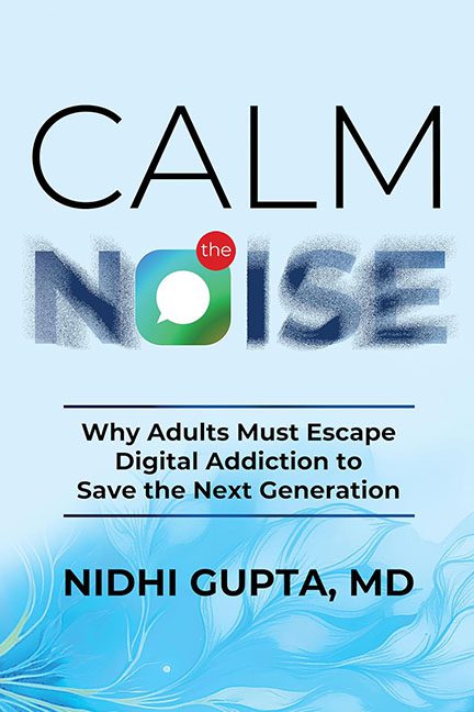
Somewhere between a wellness app ad and a failed UX workshop lies Calm the Noise—a book cover so visually conflicted, it should come with its own push notification warning:
“This design is attempting to do too much. Please force quit.”
Let’s begin with the word NOISE, because it’s the one thing this cover absolutely refuses to calm. Styled with a static-texture haze that’s supposed to scream “digital chaos,” it actually looks like your screen hasn’t finished rendering. Then comes the cherry on top of this design sundae: a giant speech bubble icon jammed into the “O,” complete with a tiny red badge that says “the”, as if it were an alert from a bootleg meditation app.
It’s not clever. It’s cluttered. And frankly, it’s having an identity crisis.
Above it, CALM is spaced in minimalist all-caps elegance, like it wandered in from a completely different book. The contrast between CALM and NOISE is intentional, sure—but it plays out like a bad breakup text: “We’re just not on the same font path anymore.”
Now let’s talk about the subtitle:
Why Adults Must Escape Digital Addiction to Save the Next Generation.
Serious. Heavy. Important. Unfortunately, visually smothered between arbitrary black lines and the digital smoke cloud above. It reads like a policy memo, tucked beneath a design that looks more like it was pitched during a yoga retreat sponsored by Google.
And then, there’s the blue wave flourish at the bottom—an abstract, flowing ocean shape that’s soft, calming… and has absolutely nothing to do with the rest of the design. Did we suddenly sail into a sleep podcast? Is there a marine subplot to this book on tech addiction? No? Then why does it look like the bottom half of a Lululemon gift card?
The author’s name—NIDHI GUPTA, MD—sits in bold sans-serif black like it’s trying to hold this whole thing together through sheer medical authority. But at this point, it’s less “trusted expert” and more “hostage in a branding experiment gone wrong.”
Let’s be clear:
The idea of visualizing the noise of the digital world is solid.
The execution, however, is like trying to do a TED Talk in a hurricane of app notifications.
This cover doesn’t “calm” anything.
It creates design whiplash, visual static, and the vague urge to delete every app on your phone and retreat into the seafoam at the bottom.
Final diagnosis?
Chronic over-design with acute metaphor overload.
Recommended treatment: One clean typeface, two deep breaths, and no more stock icons. Ever.
