They say you shouldn’t judge a book by its cover.
But sometimes a cover judges itself—and fails spectacularly.
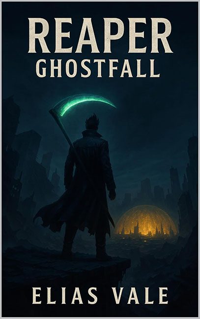
At first glance, Reaper: Ghostfall looks like a respectable piece of post-apocalyptic fantasy grit. The lone figure, the glowing scythe, the mysterious dome of light in the distance—this is clearly aiming for “graphic novel meets dystopian drama.” The mood is brooding, the color palette is slick, and that title font has big-budget energy.
But dig a little deeper, and it turns out this cover may look rather artsy… but it’s really, really fartsy.
Let’s start with the reaper himself: a stoic silhouette with a scythe so radioactive it probably needs its own hazmat permit. Glowing blades are fine, but this one is floating across his back like it’s riding an invisible hoverboard. No strap, no magical tether, no reason. Just vibes. It’s less “Death incarnate” and more “graphic design intern forgot a layer.”
But wait—it gets brighter. That glowing scythe is illuminating precisely nothing. Our reaper’s back is pitch black, despite being inches away from a literal light saber curveball. This isn’t lighting—it’s pretending to be lighting after watching one YouTube tutorial.
The lighting contradictions spiral from there. The character casts a long, moody shadow to the left, implying a light source to the right. But what’s over there? Nothing. Nada. The right side of the frame is darker than a coffee-fueled existential crisis. It’s as if the world said, “Physics? Never heard of her.”
Now behold the glowing dome in the background—a stunning visual centerpiece… that also doesn’t light anything around it. Not the rocks, not the landscape, not even the water it’s supposed to be reflecting in. It’s like a supernova that’s emotionally unavailable. The dome is having a main character moment, and it refuses to share its light with the rest of the scene.
And the architecture? Well, let’s just say the buildings are clearly under the influence of something. They’re all leaning toward the dome like it’s the last cup of coffee at a convention of sleep-deprived city planners. Gravity has left the chat. These skyscrapers are either paying homage to a cosmic light orb or mid-swoon from sheer confusion.
What you end up with is a cover that wants to be cinematic but lands somewhere between early AI art prompt and digital portfolio piece that got ghosted by logic. It’s a shame, because the vibe almost works—but like a glowstick at a funeral, the tone just doesn’t land.
So yes, Reaper: Ghostfall—you may appear dark, moody, and full of narrative weight. But strip away the ambiance, and what you really are…
is a beautifully lit optical lie wearing a scythe like a confused backpack.
Nice try, ghost boy. But next time, maybe light the room before setting the mood.
