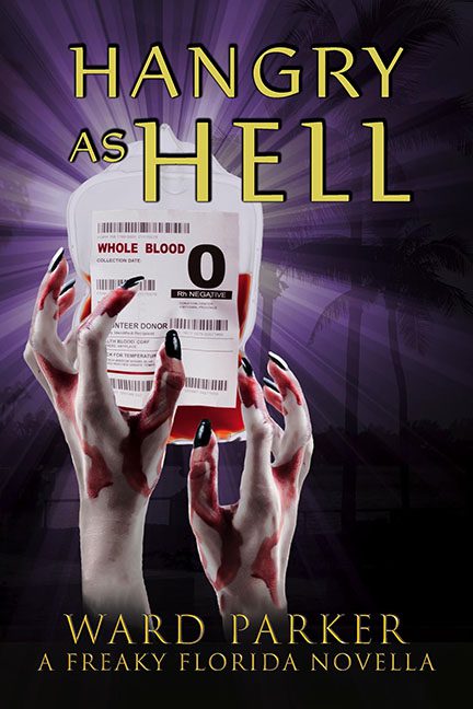
If you’ve ever wondered what happens when you mix clip-art horror with Florida tourism pamphlets, look no further than Hangry as Hell — a novella that appears to be literally hemorrhaging design choices.
Let’s start at the top. The title “Hangry as Hell” gives us a solid B-movie vibe, and honestly, we’re here for that — or we would be, if the cover didn’t feel like it was cobbled together by someone who discovered Photoshop the night before the deadline. There’s a blood bag front and center, because vampires, get it? But it’s not some dark, moody rendering — oh no. It’s a clinical, high-res, literal medical stock photo, with the words “Whole Blood” staring you down like a hospital intake form. You half expect the vampire to also be filling out insurance paperwork.
But wait — what’s that? Rising from below are not one, not two, but three hands, all clawing at the blood bag with the enthusiasm of high school theater zombies. These hands — which appear to be painted mannequin arms from a Spirit Halloween clearance bin — look less undead and more like they were caught mid-manicure. The nails are glossy black, the fingers are oddly clean, and their position suggests these creatures might actually just be hangry for hand sanitizer.
The lighting? An absolute mystery. The glowing blood bag is apparently lit by divine vampire intervention, while the hands remain shadowy and textureless. Behind it all looms a silhouetted Florida skyline, complete with palm trees and what looks like a rave light show filtered through a fog machine. Are we in Miami? Are we in a fever dream? Are we just staring into a vector-based void?
The fonts refuse to be left out of this design disaster. The title combines two different weights — one thick, one awkwardly thin — while the author’s name and subtitle opt for a fancy serif that whispers, “We’re still trying to look professional, please ignore the crime against composition happening above.”
This isn’t horror comedy. This is graphic design purgatory — where undead hands float free, blood banks glow like lighthouses, and nothing casts a shadow where it should. It’s like someone spilled a vampire-themed mood board onto a Florida travel brochure, and rather than clean it up, they hit “export as JPEG” and called it a day.
In conclusion: this cover may have been aiming for cheeky horror, but it’s giving “found footage of a Canva panic attack.” There’s a line between camp and catastrophe, and Hangry as Hell speeds past it with all the subtlety of a werewolf on rollerblades.
Would you like me to cook up a Flying Monkey Award script for this one next? Because honestly… it’s a contender.
