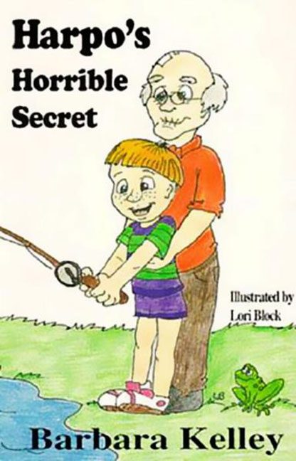
If you’ve ever wondered what it would look like if a school counseling pamphlet was illustrated by an unchaperoned classroom on “free drawing day,” look no further than Harpo’s Horrible Secret — a cover that not only crashes the design bus, but backs it up and drives over good taste a second time.
Where do we begin? Let’s start with the title. “Harpo’s Horrible Secret” already carries enough dramatic weight to raise an eyebrow. What’s the secret? Why is it horrible? We’re intrigued, but also a little alarmed. Then the cover doubles down with an illustration that immediately turns curiosity into dread.
At the center of this disaster is what we’ll generously call “art.” Two figures — a balding older man with the default face of a substitute math teacher, and a child whose exaggerated features suggest he was built entirely out of worry — stand frozen in time, locked in an awkward fishing pose. The older man’s arms wrap around the child in a way that’s clearly meant to be nurturing, but reads more like someone who failed a CPR certification course and just kept going.
The hand placement? A masterclass in absolutely not. And while we’re on the subject — the boy’s shorts are a vivid purple. Not that purple is the issue, but it’s drawn with the same energy someone might bring to filling out a tax form during an earthquake. There’s no shadow, no depth, just flat tones and regret. The facial expressions scream “forced fun,” like someone at the publisher said, “Make it look cheerful!” and the artist just screamed into a napkin and started scribbling.
The background? A randomly cropped pond on the left, a grass-green expanse on the right, and a frog who looks like he’s seen too much. There’s no perspective, no visual coherence — just clip-art chaos. Honestly, the frog might be the best part of this cover, if only because he represents the audience: horrified, speechless, and wondering how this made it past editing.
Typography? We’ve got “Microsoft Word in 1995” energy here. The fonts are wildly inconsistent with the tone, the sizing feels like it was applied by spinning a wheel, and the spacing just… gave up. The text is slathered across the page like an afterthought — one that no one had the heart to proofread.
And as the cherry on top: “Illustrated by Lori Block,” placed mid-page like a silent cry for help. We believe you, Lori. We believe you didn’t mean for this to happen. But it did.
The overall vibe is “children’s book from the Twilight Zone.” It’s not that the concept couldn’t have been handled well — it’s that this cover handles it like a drunken mime trying to defuse a bomb. It fails at tone, it fails at composition, and it fails to do the one thing a book cover is supposed to do: invite the reader in without making them back slowly away.
So here we are. A book cover that has gone down in internet infamy, not for its story, but for its design decisions — every one of which was worse than the last. If this was an art project, it would be left in the hallway with a sticky note that says, “See me after class.”
Harpo’s Horrible Secret is the visual equivalent of walking into the wrong room at the wrong time — and realizing the door just locked behind you.
Brace yourselves, folks. You can’t unread this one.
