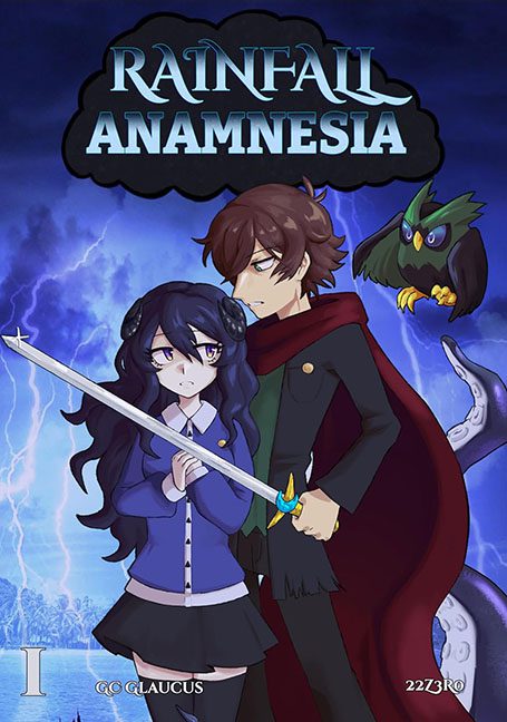
Every now and then, a cover comes along that feels less like a book and more like the poster for an anime convention that got canceled due to lightning damage. Rainfall Anamnesia (a title that sounds like it was generated by dropping a thesaurus into a puddle) is one such masterclass in chaotic energy, clashing styles, and art direction that took the day off.
Let’s begin with the obvious: the background. A stock photo of a thunderstorm raging over a swampy coastline, rendered in maximum saturation, sharpness, and confusion. The only thing missing is a “shutterstock.com” watermark. It clashes heroically with the flat cel-shaded anime characters pasted on top like stickers from a totally different universe. It’s like the background is having a life-threatening weather event and the characters are just posing for school photos.
Our two protagonists, meanwhile, look like they were drawn during lunch break in different semesters. The girl — big eyes, oversized sleeves, generic school uniform — is clutching a sword like it’s a microphone at a middle school talent show. Her expression says “mild dread” and “am I holding this right?” The boy behind her, draped in a red cloak with an expression full of brooding anime trauma, looks like he’s trying to photobomb the cover of someone else’s book. His hand grips the sword across her chest in a gesture that’s one part protective, two parts “I don’t trust you with sharp objects.”
And then there’s the owl.
Oh yes, the owl.
Perched on nothing, making eye contact with the void, flapping its wings in what appears to be a display of confusion and existential crisis. Its design is out of sync with the characters and the background — a Pokémon reject in a stormy limbo.
Also, tentacle.
There is a single, ambiguous sea monster tentacle curling into the scene on the right side like it took a wrong turn from a different genre. No context. No second tentacle. Just one lonely appendage trying its best to be menacing while failing to even break the surface tension of this design disaster.
Now let’s address the typography. “RAINFALL” is styled in a wave-texture font that says “ocean-themed waterpark,” while “ANAMNESIA” (a word that means the recollection of memories, but sounds like a typo of amnesia and anesthesia) is slapped underneath like a subtitle from an RPG no one finished developing. The font sizes, kerning, and placement feel random — like someone applied three filters and said “good enough.”
And at the bottom: “©GLAUCUS” and “22Z3RO” in minuscule text as if to whisper, we didn’t really mean for you to see this.
All together, Rainfall Anamnesia is the visual equivalent of watching five anime genres crash into a lightning storm while a tentacle tries to give CPR. It wants to be moody. It wants to be epic. It ends up looking like someone’s first attempt at a manga cover using Clip Studio, Google Images, and pure ambition.
It’s not a book cover.
It’s a group project where everyone used a different style guide and no one proofread the title.
