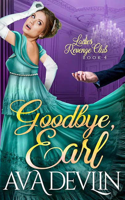
Every once in a while, a cover comes along that truly leaves you speechless — not in awe, but in utter anatomical confusion. Goodbye, Earl, Book 4 in the Ladies’ Revenge Club series, promises sass, scandal, and a good old-fashioned aristocratic takedown. What it delivers instead is Photoshop Regency Theater meets graphic design malpractice.
Let’s begin with our heroine.
She’s giving mid-swoon? Mid-strangle? Mid-performance in an off-Broadway production of Bridgerton: The Musical (And Also a Crime Scene)? Her head is tilted so far back it looks like she just saw her own cover design reflected in a mirror and is reacting accordingly. The expression? A mixture of murder, melodrama, and mild scoliosis.
Her gown is a teal satin fever dream, flowing with all the realism of melted plastic and lit from a light source that no one else in the image seems to be aware of. Her gloves stretch awkwardly into white sausages, her pearl belt hovers in space, and her right arm seems to be levitating independently of her body, possibly planning its own solo novella.
And then… the arm.
That rogue, disembodied, suit-sleeved hand grasping her skirt like it’s trying to hold on for dear life. Where is the rest of this man? Why is the arm reaching in from the void? Did the earl vanish mid-confrontation? Was he Thanos-snapped out of existence, leaving only his weirdly tiny wrist as a memento?
Lighting? All over the map. The background is a purple-drenched ballroom with the ambiance of a 1980s prom night haunted by a ghostly chandelier. She’s lit like she’s in a soap opera. The arm isn’t lit at all. The shadows disagree with every part of the narrative. It’s like each asset was photoshopped in separately and no one told them they were all supposed to be in the same scene.
Typography? A crime of passion.
The title, Goodbye, Earl, is scrawled across her midsection in highlighter-yellow script so shiny it looks like it was piped on with fondant. It’s not elegant. It’s not menacing. It’s not even legible in places. It’s just… big. Loud. Slightly unhinged. The font used for “Ava Devlin” is an entirely different flavor — all caps, serif, and cold as death — which might be appropriate, if not for the fact that it looks like it wandered in from a legal thriller.
And let’s not ignore the header: Ladies’ Revenge Club, Book 4. A fun concept, absolutely. But the text is squashed in the upper corner in such a faint, curly font it looks like it’s embarrassed to be part of this ensemble.
All together, Goodbye, Earl is not a book cover.
It’s a scene of visual manslaughter, where a dozen design elements were introduced at a party, got into a fight, and someone called the fonts too late.
This is what happens when Regency romance tries to serve camp but gets lost in the stock photo aisle and falls into a barrel of bevel effects and drop shadows. The vibe may be murder, but the real victim here is design integrity.
