
The Pharaoh’s Cat unfortunately falls into what many in the design world refer to as “fridge art”–an earnest but amateur attempt that lacks the polish, composition, and professionalism expected for a commercially viable book cover. It hinders, not helps, sales.
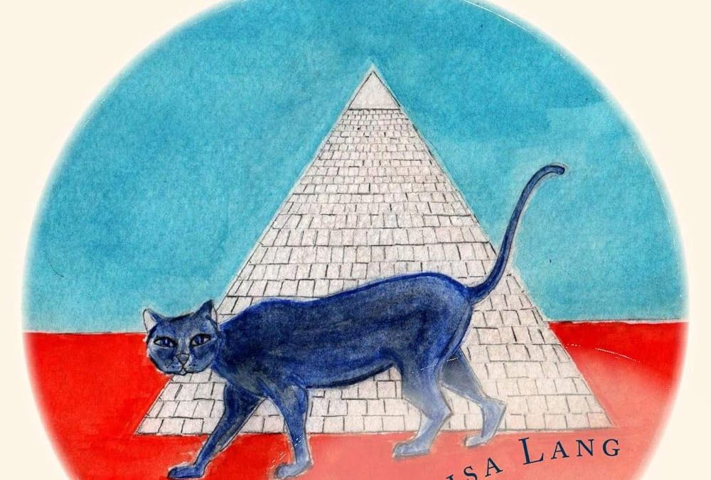
The illustration is simplistic and unrefined, with flat colour fills and minimal shading. The cat, while central to the design, lacks character definition and visual depth. The pyramid in the background looks more like a rough doodle than a deliberate design element. There’s no texture, lighting, or perspective that would give the scene any sense of dimension or visual interest.
From a typography standpoint, the cover doesn’t fare much better. The curving of the title and author name feels awkward rather than intentional. The serif font choice comes across as default and uninspired, doing nothing to enhance genre appeal or visual hierarchy. Additionally, the light font weight almost guarantees poor readability at thumbnail size on online marketplaces like Amazon.
The colour choices don’t help either. The stark, primary colours–red, blue, and cream–feel disconnected and visually jarring. There’s no sense of palette cohesion or mood development. The overall result is a cover that looks hastily assembled with little understanding of colour theory, composition, or genre expectations.
For a book positioned in General Humor, this cover does very little to communicate comedic tone, narrative hook, or quality. Instead, it gives the unfortunate impression of a self-published project with no professional input.
In a highly competitive market, where readers judge books in a split second, a cover like this isn’t just a missed opportunity–it’s a sales deterrent.
- Upgrade the Artwork:
- Move away from flat, childlike drawings.
- Commission or create clean, vector-based or semi-illustrative digital art with better depth, shading, and personality.
- The cat should have more facial expression and character–quirky, mischievous, or sarcastic to fit humour expectations.
- The background (pyramid, desert, etc.) needs texture, atmospheric perspective, and lighting effects to create depth.
- Add small visual humor cues: sunglasses on the cat, a scroll, or something visually witty that hints at the tone.
- Revamp the Typography:
- Replace the current serif with a bold, quirky, or playful font that suits humor.
- Good font options for humor:
- Baloo Bhai
- Fredoka One
- Bangers
- ChunkFive
- Experiment with text effects: Drop shadow, stroke, or subtle grunge overlays to ensure the title stands out even at thumbnail size.
- Consider a fun typographic layout–angled text, or even making the cat interact with the title (e.g., paw batting at a letter).
- Fix the Color Palette:
- Choose a more cohesive and appealing colour scheme: Warm golds, desert tans, deep blues, and pops of fun accent colours (like coral or teal).
- Avoid stark primary colour clashes.
- Add gradients or texture overlays to give the background and foreground layers separation and visual interest.
- Improve Layout and Composition:
- Create a clear focal point with strong rule-of-thirds placement.
- Ensure text-to-image balance–the eye should know where to land first.
- Make sure the title dominates but leaves space for visual breathing room.
- Design for Thumbnail Visibility (Amazon-Focused):
- Make sure the title is readable at 120×180 px (Amazon thumbnail size).
- Author’s name should be legible but secondary.
- Use bold contrasts for text on lighter or busier backgrounds.
Summary:
By upgrading the illustration quality, choosing better typography, improving color harmony, and focusing on visual storytelling, this cover could transform from “fridge art” to a fun, market-ready humor title that holds its own on Amazon shelves.
