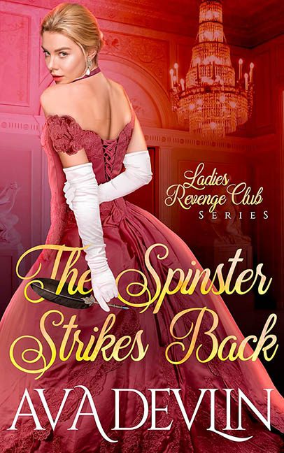
What do you get when you mix a period drama, a revenge plot, and a stock photo model who looks like she just remembered she left the oven on? You get The Spinster Strikes Back — a cover that promises sass and scandal but delivers something more akin to Satin Clown School meets Typographic Carnage.
Let’s start with the heroine. She’s giving us over-the-shoulder smirk, full “I just poisoned the punch bowl at the Duke’s ball” energy. But what’s that in her hand? A dagger? A pie server? A weapon of vengeance, sure — if vengeance means lightly bruising someone with a foam prop from the local Renaissance Faire. The way it’s floating in her hand says “I didn’t bring a weapon to this photoshoot, so someone added one later and hoped for the best.”
Her dress is a red-on-red-on-rose pile of digital fabric confusion. It’s laced, ruched, fluffed, and possibly cursed. The gloves are elbow-length, the shoulders are off, the back is exposed, and somewhere in there, design rules went to die. The lighting on her skin says “soft candlelight,” the dress says “spotlight at a drag show,” and the background chandelier? It’s so overexposed it looks like it’s preparing for takeoff.
And then there’s the title.
Oh, the title.
The Spinster Strikes Back is not so much written as unleashed across the bottom of the cover in banana-yellow calligraphy with the legibility of melted frosting. Each word swirls dramatically over folds of the gown like it’s trying to hide from the reader. “Strikes” is diving into a pleat. “Spinster” has been flung across her hip like a monogrammed napkin. It’s less a title and more a drunken cursive duel between passion and readability.
Above it, “Ladies’ Revenge Club Series” hides shyly in the top right corner, as if it wants nothing to do with what’s happening below. Smart choice.
Let’s not ignore the color palette — red, burgundy, blush, cherry, and whatever color regret is. It’s like the entire cover is blushing from embarrassment while trying to pass itself off as sultry. The whole thing is saturated to the point of hallucination. This isn’t revenge. This is Retina Assault: Regency Edition.
In summary:
-
The dagger is confused.
-
The dress is loud.
-
The font is actively committing crimes.
-
And the spinster? She’s striking back at design logic, and she’s doing it in Comic Sans’ evil cousin.
The Spinster Strikes Back isn’t just a cover — it’s a regency fever dream sponsored by bad decisions and a sale on Photoshop filters. Good for her. Bad for everyone else.
