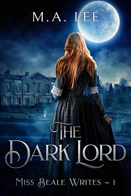
Well, well, well… look what almost slipped past us in the dead of night.
At first glance, The Dark Lord looked innocent enough — moody lighting, gothic vibes, an appropriately ominous moon. We nearly let it walk straight past the bouncer and into the “acceptable book cover” club. But something about it whispered, “Wait… look again.”
So we did.
And now?
We’re calling the authorities and dragging this sneaky disaster out by its Victorian bustle.
Let’s begin with the main figure, our flame-haired heroine gazing wistfully into the eternal gloom. Or rather, hovering awkwardly in front of it. The moment you actually focus, you realize she’s not in the scene at all — she’s pasted onto it like a Regency-themed Zoom background. Her feet? Vanished in the fog. Her shadow? Missing entirely. She’s floating just slightly above the ground like she’s haunting the estate, not visiting it.
Speaking of lighting:
Let’s talk physics violations.
The moon is behind her — low in the sky, radiating blue-white drama — yet somehow, the front of the mansion is lit up like it’s high noon, and her body is catching light from… multiple conflicting directions? Her hair is backlit, but the side of her dress is also lit. And her back? Glowing like there’s a 500-watt flashlight just off-camera. Unless the moon has a twin with a spotlight complex, we’ve got a lighting logic breakdown.
And then…
The fog.
Oh, the fog.
This isn’t atmosphere — this is Photoshop filter abuse in the third degree. There’s fog in front of her. Fog behind her. Fog on top of the mansion, like someone poured dry ice over a dollhouse. And the lower you go, the darker and mushier it becomes, as if the fog itself is just giving up. It doesn’t enhance the mood — it blurs the crime scene.
Let’s also call out the title work, which feels like it was designed in a rush by someone who just discovered the “gothic” font tab. “The Dark Lord” has nice kerning, but it’s so eager to be dramatic it forgets to be legible at a glance. The “Miss Beale Writes ~ 1” tagline? Cramped and floating like a lost footnote. It’s not part of the design — it’s a passive-aggressive whisper at the bottom of the cover.
But the real trick here is how almost good it looks from a distance. That’s the scam. It’s the con artist of bad covers — professionally dressed, but with a fake ID and fog trailing behind it. It wants you to think it’s a polished piece of gothic romantic mystery. It nearly made us believe.
But then you zoom in.
And the truth reveals itself, like a cursed moonbeam through a badly layered PSD file.
Congratulations, The Dark Lord.
You nearly got away with it.
But we see you now — and no amount of digital mist can hide a paste job this obvious.
